


Gauges are frequently used in information dashboards, but it is most often a bad choice. Gauges provide very little information for the amount of space they consume, and other types of charts are much better at presenting data in ways that help decision makers.
by Robert Allison
April, 2007
I suppose the original intention behind the use of gauges in dashboards was good - probably something along the lines that if everybody could read the gauges in an automobile dashboard and know the state of their car (speed, fuel level, temperature, etc) then everyone could easily relate to a similar 'dashboard' showing the state of their business.
But ever since the name 'dashboard' was adopted, people designing information dashboards have felt compelled to try to make them look like a gauge-centric dashboard in a car. And this limits those car-like information dashboards to only showing a small amount of information, and therefore being of limited usefulness.
A gauge takes up a lot of space, and generally only shows a single value (and sometimes a 'target') plotted against some scale. Here is a simple gauge showing a value (light arrow/hub), and a target (black arrow), plotted against a scale (the 3 colored ranges). This is about as much as a gauge can do.

When making a decision, a manager typically needs to compare several values. And this is very difficult to do with gauges. Case in point - try comparing the values of the following 4 gauges. Notice the 4 gauges take up almost the entire screen, and it's not easy to quickly compare their values, targets, or scales...


Now see how much easier it is to compare the values using a single bar chart (see below)! The bar chart shows the same information as the 4 gauges, but in 1/4 the space, and in a layout that makes comparing the values very easy (notice the bars even have charttip & drilldown capability!). Now you can easily see (at a glance) that 'A' was the only one of the 4 that exceeded its target value, and that 'C' was much lower than all the others (actually in the <10% 'red'). You can also easily determine more subtle things, such as the target values being slightly different for each of the 4 bars, and the ranges are the same for all 4.
Another limitation of gauges is that they don't show trends over time. Since a gauge only shows 1 value, they only represent a single 'snapshot' in time (such as 'the present'). So, using the previous example, let's say the gauge represents the December value. What does this gauge tell you about how the company is doing?

A line chart is usually the best choice to show trends over time. And, similar to the gauge, you can overlay the line on top of colored target ranges, to show the same sort of information the gauge showed. In the following examples, I show 12 monthly values in 1 line chart. They all have the same December value as the gauge chart (above), but they all tell different stories when considering the December value in the context of the past values. Imagine viewing 12 separate gauges to try to gain the same insight provided in any of these line charts!
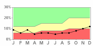
| Interpretation: Performance has been consistent throughout the year, but the target/goal values have been raised twice, such that what used to be 'good' performance is now 'marginal' performance. Are these higher expectations reasonable, and have they been well communicated? - Perhaps this situation needs more investigation. |
|
|
| Interpretation: After struggling with poor performance since April, the numbers have been improving the past few months, and are headed in the right direction. |
|
|
| Interpretation: The company had been doing well before December, and then performance suddenly dropped. Although not in the red/poor performance range yet, this certainly warrants investigation. |
|
|
Of course, once you can see the historical trends in the data, the next logical step is to want to predict the future values - that's where the real power of SAS comes into play, providing over a quarter century of R&D behind their advanced analytics procedures to provide forecasts (and other data analyses), and customizable graphics procedures to present the data any way you want it. Now, try doing something like this using gauges!
------------------------------------------------------------------------------------

Note that the gauges in this sample use "proc gkpi", which is
new in v9.2 sas (ie, customers won't be able to use it until
v9.2 ships).


Click here to see the SAS code for the gauges.
Click here to see the SAS code for the bar chart.
Click here to see the SAS code for the line chart.
Click here to see the SAS code for the forecast line chart.

Click here to see the SAS output for the gauges.
Click here to see the SAS output for the bar chart.
Click here to see the SAS output for the line chart.
Click here to see the SAS output for the forecast line chart.

This short paper is my own version of Charley Kyd's excellent
Down With Gauges! article found on the Excel User website.
I very much agree with Charley's observations about using gauge
charts in dashboards, but I wanted to take the article perhaps
a step further, showing how customized SAS/Graph charts can
be used to replace dashboard gauges, and also mention the
usefulness of forecasting & analytics.
Back to Samples Index