THIS PAPER IS STILL UNDER CONSTRUCTION!!
V9.2 SAS/Graph has a *lot* of additions & enhancements you'll want to know about! Some of the changes will make your output look better and make SAS/Graph easier to use, while others add totally new functionality. Here are several examples that just might change your "quality of life" as a sas user!
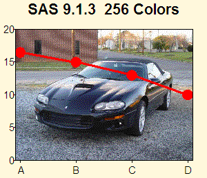
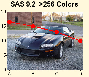
V9.2 SAS/Graph supports over 16 million colors! This is probably the biggest & most exciting change, in my opinion, and will have a profound impact on the quality of your graphics output.
Prior to v9.2, SAS/Graph had a limit of 256 colors. The 256 colors are not only consumed by the colors you specify, but also the shades of colors that are needed for anti-aliasing the edges of fonts, gradient shading on the sides of 3d cylinder-shaped gchart bars, images you include in the graph, etc. When you run out of colors, the results are a bit "unpredictable".
This increase in colors is only supported in certain SAS/Graph devices such as device=png (device=gif, for example, will never support >256 colors in SAS/Graph, because the gif standard itself does not support >256 colors). Therefore, if you have sas jobs that are hard-coded to use device=gif, you'll want to change them to use device=png. Device=png is the new default in v9.2, therefore if you haven't hardcoded a device, then you'll automatically get device=png.
With more colors, your output can look better, because more shades are available, therefore when images/photos are incorporated into graphs they have a more true/undithered look, as demonstrated in the example below.
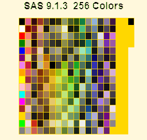
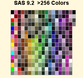
Also, when SAS/Graph only supported 256 colors, it was unable to display all of the 292 "named" SAS/Graph colors (as demonstrated in the first/left graph below), and after it runs out of colors, it uses dark yellow for the additional color-swatches and the outlines around the annotated color rectangles (in this particular example), and the anti-aliasing around the edges of the title text looks very bad. In v9.2 all 292 named SAS/Graph colors can be displayed in a single graph, and the anti-aliasing around the title text looks much better:
In V9.2 SAS/Graph, the default fonts are nice smooth-edged (anti-aliased) fonts, and will look much better than in previous versions. You can also use these new fonts (such as "Albany AMT", which looks like "Arial") on all hosts (Windows, Unix, Mainframe), thereby making it easier to write code which will produce nice output no matter where you run it.
Prior to v9.2, SAS/Graphs used the SAS/Graph software fonts as the default. The SAS/Graph software fonts are not rendered with smooth (anti-aliased) edges, and can look somewhat 'jagged'. The reason the sas/graph software fonts were previously used as the default (as opposed to some of the nicer truetype and other fonts that might be on your system) is that they were the only fonts guaranteed to always be there, and look/work the same, on all hosts.
For v9.2, sas bought re-distribution rights for several nice-looking fonts from the font foundry called 'Monotype Imaging' (the term 'foundry' comes from the days of old when companies actually used lead to make the font characters). Now you can run the exact same sas code on Windows, Unix, and Mainframes, without having to change the font. Albany AMT is used as the default graph font in most cases in v9.2. The example below shows a 'proc gslide' with a title1 & title2, to show the default ftitle & ftext.

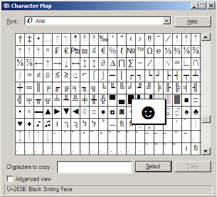
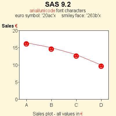
Also new in v9.2, Unicode character codes can be used to specify characters in a font. (Note that the Unicode support only applies to fonts, such as TrueType fonts, which support Unicode.) To see these characters, you can run the Start->Programs->Accessories->System_Tools->Accessories->Character_Map on Windows, and select a font such as Arial, and scroll way down in the list, and click on some of the more interesting characters, and see the 4 hex-digit codes for them (see the screen-capture on the left, below). Note that in the 9.2-classic release, unicode character codes that start contain a '20'x (such as the '20ac'x euro symbol) do not work as gplot symbols - hopefully this will be fixed in v9.2-platform release (S0483680 - put a link to the sas note here, after it is written). The example below shows using the arial/unicode 'smiley' character in a gplot scatter chart, using the 4 hex-digit code in the symbol statement as follows:
symbol1 font="arial/unicode" value='263b'x
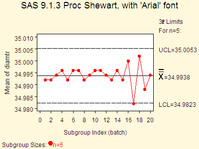
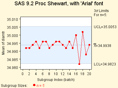
The new v9.2 fonts also helped improve the output for some of non-SAS/Graph procs that use SAS/Graph technology to draw graphs. For example, in v9.1.3 Proc Shewhart required you to use the jagged-edged SAS/Graph software fonts, in order to get statistical characters such as 'sigma' to show up on the graph correctly - if you specified a nice smooth-edged font (such as 'Arial') then the sigma character (near the top/right of the graph below) looked bad. With the new fonts in v9.2, the special statistical characters (such as sigma) should always look good, no matter which font you specify. This enhancement should greatly help, in producing publication-quality output from these procs, for inclusion in magazines, etc.
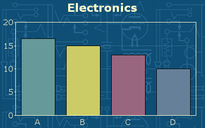
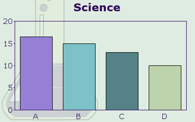
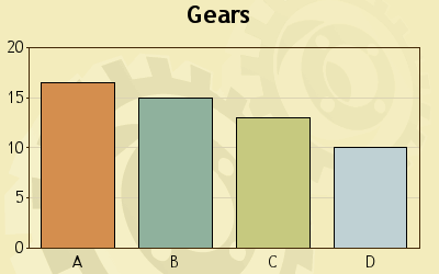
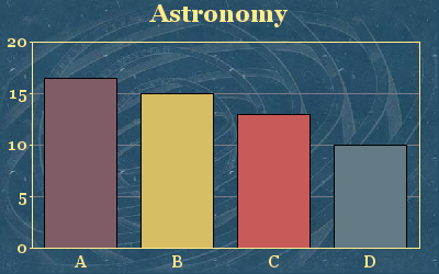
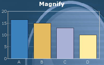
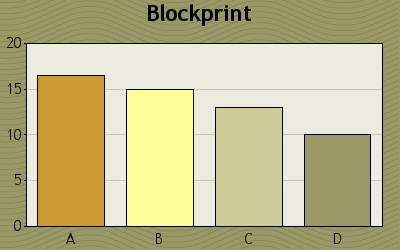
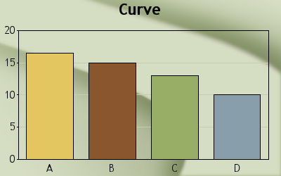
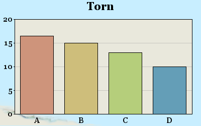
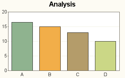
In v9.2, you can use the new Graph Styles to automatically assign pleasing color combinations for the background, the text, the axes, and the chart elements (such as bars, plot lines, map areas, etc). They also control the font of the text, and some come with a decorative background image. This gives you a very easy way to quickly generate fancy graphs with a lot of 'flash' and 'pizazz', without writing a lot of code.
Below are some examples of v9.2 graphs using various styles using device=png
(previously the graph styles only worked with java & activex) - the name of the
style is in the title of the graph.
You can get a complete list of all the ODS graph styles by submitting the following sas code:
proc template; list styles; run;
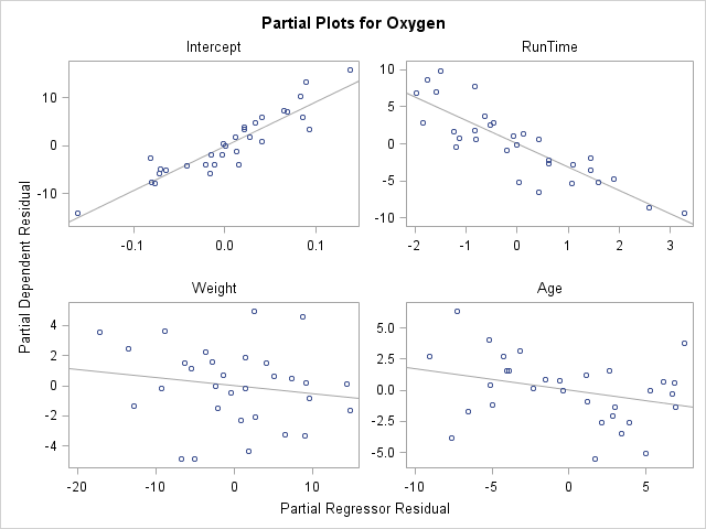
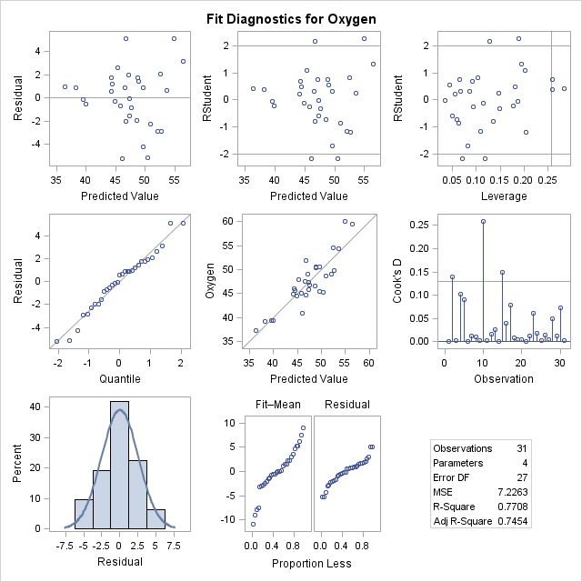
ODS Graphics (sometimes known as 'stat graph') is going production for many procs in v9.2. In the past, the SAS/Stat procs did analytics and produced output data sets and tables (and sometimes basic ascii-art plots), and the users had to then write their own SAS/Graph code to produce nice "publication-quality" plots of the results. In v9.2, you can now specify "ods graphics on" and fancy graphical representations will be automatically created for you, for many SAS/Stat procs (and procs from a few other products, such as SAS/ETS and SAS/QC, as well). Prior to v9.2, "ods graphics on" was experimental and you did not need a SAS/Graph license to use it - now that it is production you do need a SAS/Graph license.
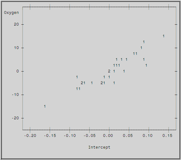
Below is a comparison of Proc Reg's old ascii output to the new "ods graphics on" output.
This first plot is an example screen-capture of an old V9.1.3 (non-"ods graphics") output plot -- it is created from ascii characters (letters, numbers, _, |, etc) - markers in the plot are represented by a '1' and if multiple markers are too close to represent as two '1's, then they are represented by a '2'. Ascii-art plots are not generally condisered "publication-quality". The two examples below it show a few of the nice publication-quality plots created by the v9.2 "ods graphics on".
And here are a couple of the new V9.2 "ods graphics on" plots - the top/left plot is the same data as was represented in the ascii-art plot above. In addition to higher-quality plots, "ods graphics on" produces more plots, and more complex plots (such as histograms with smooth overlaid lines).
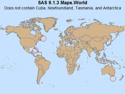
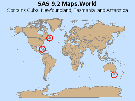
In v9.2, you can now specify a width variable in your annotate data set, to control the width of circles drawn with the 'pie' function. The following example demonstrates the new width functionality, and also shows off the new/improved v9.2 maps.world which contains Cuba, Newfoundland, Tasmania, and Antarctica (which were missing in the v9.1.3 map).
V9.2 SAS/Graph has a new arrow annotate function, which allows you to easily draw arrows, similar to how you draw line segments using the move/draw annotate functions. Previously, you had to work out all the geometry and draw the arrow heads using move/draw line segments (or annotate a wedge of a pie slice in just the right position and orientation so that it looks like an arrow head). This new 'arrow' function will make life *much* easier!
Several SAS/Graph Procs have been added in v9.2 that provide exciting new graphical functionality. They provide an easy way to generate graphics that were out of reach of most sas users in the past (because they would have required much custom programming & use of annotate to create in previous releases). Now you can simply run these new procs, and *poof*, you have the neat new grapic!
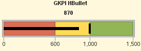
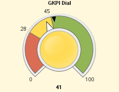
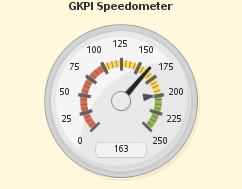
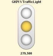
Proc GKPI (which stands for Graphical Key Performance Indicator) is a new proc that produces several widgets that people seem to want for their dashboards. I won't get into the discussion about whether or not dials & gauges are "good" to use, but this proc now makes them easy to use :)
Proc GKPI can produce Bullet and Slider graphs:
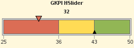
And also Dial, Speedometer, and Traffic Light graphs:
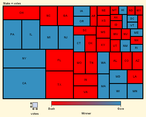
Proc GTILE creates Tree Maps (or Tile Charts). In these graphs, one variable controls the size of the rectangle, and another variable controls the color. The following example shows the Year 2000 election results - the size of the rectangles represents the number of votes in each state, and the color represents the winner of the votes.
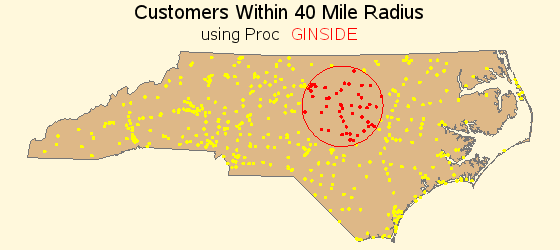
Proc GINSIDE allows you to programmatically determine whether a given point is inside of a given map area. This is very handy for doing geo-spatial analytics about your customers, tracking the spread of diseases, performing environmental impact studies, etc.
Proc GEOCODE allows you to estimate the latitude/longitude location
of an address. In this first release (9.2-classic) proc geocode will only estimate
the location down to the city or zipcode level. Using proc geocode to calculate
the average centroid of a city's zipcodes is much easier than manually calculating
the average location using SQL queries or other sas procs to calculate it.
Quite literally, it only takes this much code to do city-level geocoding:
proc geocode CITY data=teams out=teams;
In future releases, hopefully street-level geocoding will be added.
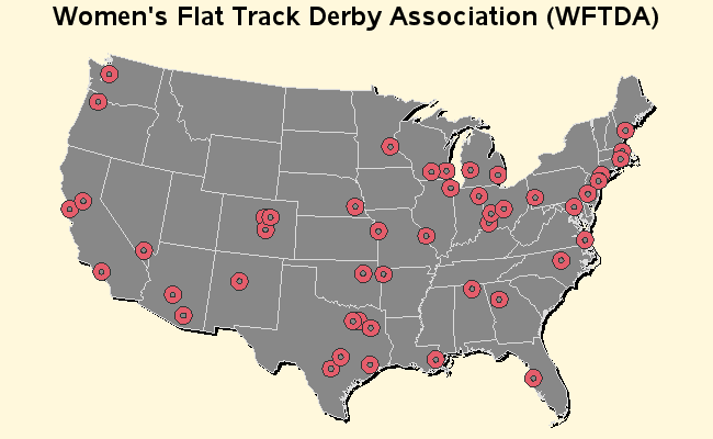
Once you have the geocoded lat/long coordinates, you can annotate markers
onto a map at those locations, such as the map below:
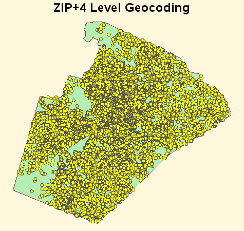
Proc Geocode can also do ZIP+4 geocoding. Note that regular zipcode-level geocoding is a bit easier, because it uses the sashelp.zipcode file that ships with sas -- to do zip+4 geocoding, you must download a large lookup data set with the zip+4's and their lat/long centroids. You can download a zip+4 data set derived from the Census Bureau 2006 Second Edition TIGER files, from the SAS maps online website.
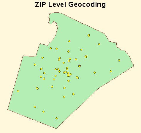
The two examples below demonstrate the difference between the regular zipcode-level geocoding and zip+4 geocoding. The geocoded centroids of all of the regular (5-digit) zipcodes based in Wake county North Carolina are plotted on a Wake county map on the left, and the zip+4 locations of all those same zipcodes are plotted on the map to the right. Zip+4 gives you a *whole* lot more precision/granularity.
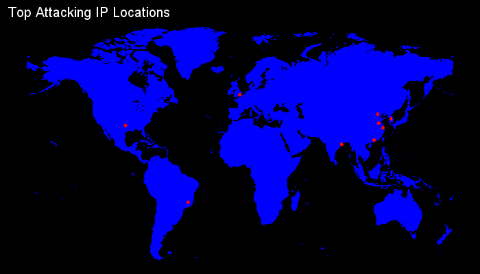
In the v9.2-platform release (which will ship sometime after the v9.2-classic release), proc geocode will add support for geocoding IP addresses. This can help you spatially analyze your web logs and find out where your web traffic is coming from, which can be *very* useful for your sales analytics, security monitoring, etc. Here's an example that shows what you might do with geocoded IP address locations.
Several of the existing SAS/Graph procs have been enhanced in v9.2. New features & options were added, bugs were fixed, etc. These enhancements should help improve the quality of your graphs - and maybe your quality of life, as well! ;)
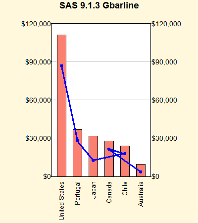
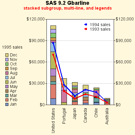
Proc GBARLINE has several nice enhancements in v9.2. Previous versions of GBARLINE allowed only a single PLOT statement referencing one variable and generating one plotted line. You can now use multiple PLOT statements with different variables to graph separate lines. The SUBGROUP option was added to the BAR statement, which allows bars with stacked subgroups. This behavior is identical the SUBGROUP option in PROC GCHART's VBAR statement. Support for the LEGEND option was also added. You can use it on either the BAR or a PLOT statement or on both. You cannot use it on more than one PLOT statement. It does not have to be on the first PLOT statement, but you are limited to one PLOT legend. You can position the BAR and PLOT legends independently, e.g. upper left for BAR and lower left for PLOT. You can also put them in the same position and they are drawn as one legend. Also, previously if you used the 'descending' option, the line didn't look right because it was connected in data-order rather than descending left-to-right order - that problem is fixed in v9.2.
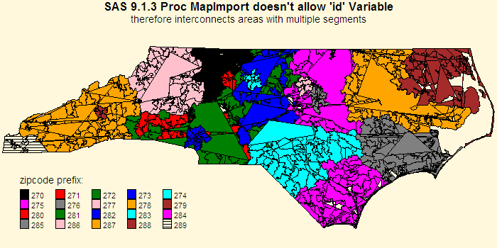
Proc MAPIMPORT allows you to import ESRI shape files into sas, so you can use them as SAS/Graph maps with Proc Gmap. In v9.1.3 Proc Mapimport didn't allow you to specify an 'id' variable, therefore if map areas had multiple segments they got interconnected by what appeared to be a 'stray' line in the map, and this also caused the polygons to sometimes be drawn incorrectly (you would generally see big triangles) - there were some work-arounds whereby you could add your own 'segment' variable (but that's a lot of work). Without the work-arounds an imported zipcode map would look like the v9.1.3 example below, for example.
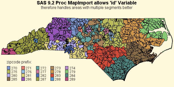
In v9.2, Proc Mapimport has been ehnanced, and allows you to specify an 'id' variable (such as 'id zcta') - and with knowledge of the id variable, it can better intuit when it is encountering disjoint 'segments' of a map area. Therefore the v9.2 imported maps look and work *much* better, without requiring you to use kludges to add your own segment variable, etc. This is a tremendous improvement, and should be a big help for those that need to import maps into sas.
The example below also shows off the new pattern colors & shades which are the default in v9.2 (as opposed to the short list of primary colors which gets reused when it runs out in the v9.1.3 example above).
Proc GMAP allows you to (cdefault, gradient shading, density)


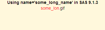
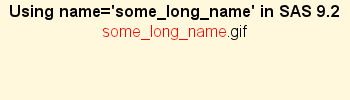
The NAME= option for SAS/Graph procedures has been enhanced to allow you to specify filenames up to 256 characters (previous limit was 8 characters) for graphics output files (PNG files, GIF files, and so on). Name= also allows the use of #byval in the name, which now allows you to use values from the data to easily produce long meaningful/mnemonic filenames when you're using "by" statements. This will make life *much* easier on you, if you care about output filenames, (for example, if you use the filenames as drilldowns in webpages). Right-click on the gslide examples below, and view the 'properties' to see their gif filenames.