Click here to see the SAS code.
Click here to see the example.
---------------------------------------------------------------
This graph was inspired by the following blog:
http://sas-and-r.blogspot.com/2012/04/example-925-its-been-mighty-warm-winter.html
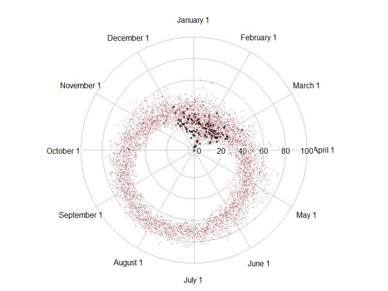
The graph in the blog originally had an error, such that the
'*' markers from this past winter were plotting much colder
(closer to the center) than they should. Here is the original
wrong graph (created with R):
 I wrote a SAS/Graph custom plot to plot the data in the same way,
and plot it correctly. Upon seeing my version, the author of the
blog realized the problem, and re-wrote his graph.
Here's my version:
I wrote a SAS/Graph custom plot to plot the data in the same way,
and plot it correctly. Upon seeing my version, the author of the
blog realized the problem, and re-wrote his graph.
Here's my version:
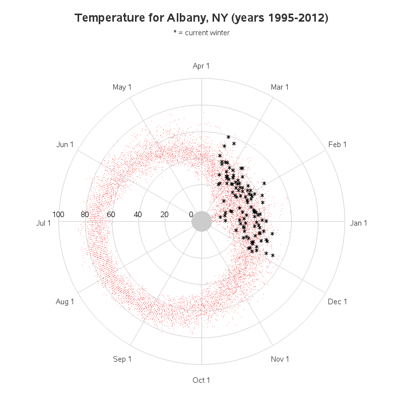 I use annotated function='pie' to draw the rings, and place the
text & markers at the appropriate locations on the polar plot.
Back to Samples Index
I use annotated function='pie' to draw the rings, and place the
text & markers at the appropriate locations on the polar plot.
Back to Samples Index