Click here to see the SAS code.
Click here to see the example.
---------------------------------------------------------------
I originally saw a similar map in this blog:
http://ansonalex.com/infographics/facebook-user-statistics-2012-infographic/
But I noticed that the pie slices appeared to be the wrong size.
Look closely, and you'll notice that the black slices are too small.
(for example, if the North America value was ~50%, then the two
pie slices should be about the same size.)
Here's a screen-capture of their incorrect pies:
 So I created my own version, so that I could have properly-sized
pie slices (created programmatically with SAS, based on the numeric
values).
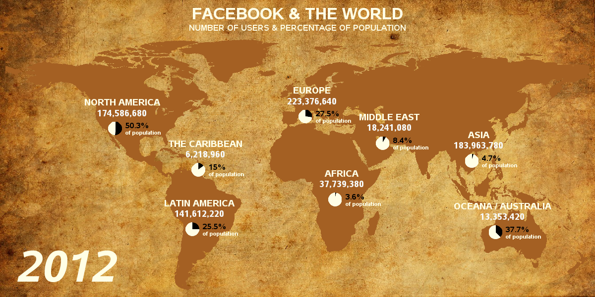
Here's my version, with correct pie slice sizes:
So I created my own version, so that I could have properly-sized
pie slices (created programmatically with SAS, based on the numeric
values).
Here's my version, with correct pie slice sizes:
 Back to Samples Index