Click here to see the SAS code.
Click here to see the example.
---------------------------------------------------------------
Similar to graph in this article:
http://online.wsj.com/article/SB10001424127887323610704578626142861572144.html?mod=WSJ_Opinion_LEADTop#articleTabs%3Darticle
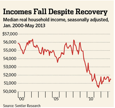 Except rather than just showing the graph with min/max axes, I also
show the graph with axes starting at zero ... and also a 3rd version
that shows the data back to 1975.
I think showing these 3 versions provides a much better understanding
of the data.
-----
Used data from here:
http://www.census.gov/hhes/www/income/data/historical/household/
Table H-6. Regions-by Median and Mean Income
.All Races [XLS - 1.9M]
http://www.census.gov/hhes/www/income/data/historical/household/2011/H06AR_2011.xls
Back to Samples Index
Except rather than just showing the graph with min/max axes, I also
show the graph with axes starting at zero ... and also a 3rd version
that shows the data back to 1975.
I think showing these 3 versions provides a much better understanding
of the data.
-----
Used data from here:
http://www.census.gov/hhes/www/income/data/historical/household/
Table H-6. Regions-by Median and Mean Income
.All Races [XLS - 1.9M]
http://www.census.gov/hhes/www/income/data/historical/household/2011/H06AR_2011.xls
Back to Samples Index