Click here to see the SAS code.
Click here to see the example.
---------------------------------------------------------------
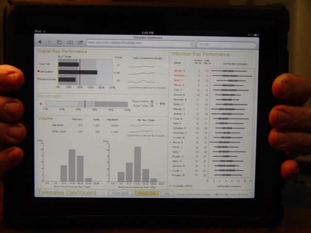 This dashboard is a sas/graph imitation of the dashboard on p. 199 of
Stephen Few's book "Information Dashboard Design". The pictures in
his book were "hand drawn", and there is no other software I know of
that has shown they can implement his dashboards programmatically,
other than SAS :)
I've made a few changes (hopefully enhancements/improvements :)
in my sas version...
1 - The sparclines are shown as a percentage of target, which makes
them easier to compare to one another.
2 - Instead of just putting the 2 values in a table beside the
Rep Utilization chart, I "stack" them in the old-style
elementary school algebra-style, and show the calculated
percentage beside them.
3 - Instead of drawing a red box around the worst 4 reps,
I just make their names & orders & calls red.
Also, since this is an html web version, I am able to add
charttip text (hover your mouse over the bars and such to see it),
and drilldowns. The drilldowns don't really go anywhere, but it
shows that you could have them :)
I also implemented the freeze/unfreeze button in a proof-of-concept
sort of way ... for this to really work, I'd have to have changing
data, and I would need to have a sas/intrnet server to generate
the graphs on-the-fly (in this simple standalone sample, I've
pre-calculated all the freeze & unfreeze graphs).
---
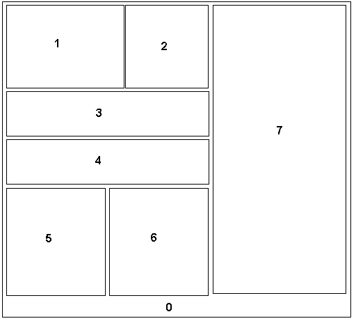
There's quite a bit of "annotate" used to create these custom charts.
But, I have implemented it in a way that the annotation is data-driven
(ie, when the data changes, and the sas/graph code is re-run, the
annotation will be dynamically generated, based on the new data
values).
I used "proc greplay" to lay out the dashboard, and here is how
the sections of the template are numbered:
This dashboard is a sas/graph imitation of the dashboard on p. 199 of
Stephen Few's book "Information Dashboard Design". The pictures in
his book were "hand drawn", and there is no other software I know of
that has shown they can implement his dashboards programmatically,
other than SAS :)
I've made a few changes (hopefully enhancements/improvements :)
in my sas version...
1 - The sparclines are shown as a percentage of target, which makes
them easier to compare to one another.
2 - Instead of just putting the 2 values in a table beside the
Rep Utilization chart, I "stack" them in the old-style
elementary school algebra-style, and show the calculated
percentage beside them.
3 - Instead of drawing a red box around the worst 4 reps,
I just make their names & orders & calls red.
Also, since this is an html web version, I am able to add
charttip text (hover your mouse over the bars and such to see it),
and drilldowns. The drilldowns don't really go anywhere, but it
shows that you could have them :)
I also implemented the freeze/unfreeze button in a proof-of-concept
sort of way ... for this to really work, I'd have to have changing
data, and I would need to have a sas/intrnet server to generate
the graphs on-the-fly (in this simple standalone sample, I've
pre-calculated all the freeze & unfreeze graphs).
---
There's quite a bit of "annotate" used to create these custom charts.
But, I have implemented it in a way that the annotation is data-driven
(ie, when the data changes, and the sas/graph code is re-run, the
annotation will be dynamically generated, based on the new data
values).
I used "proc greplay" to lay out the dashboard, and here is how
the sections of the template are numbered:
 Back to Samples Index