Click here to see the SAS code.
Click here to see the example.
---------------------------------------------------------------
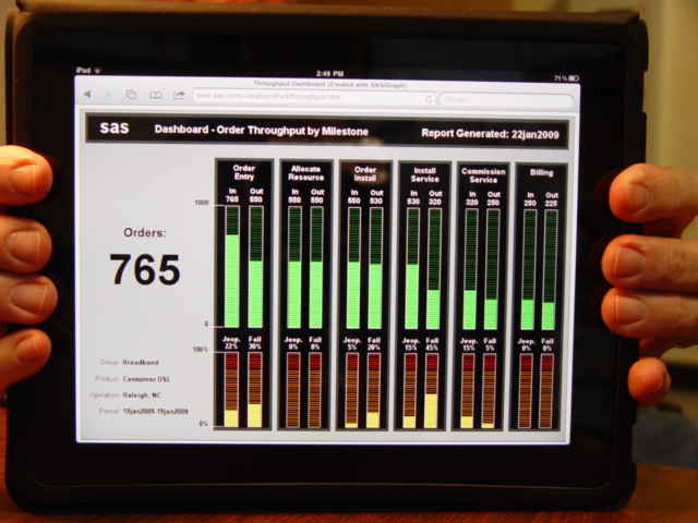 This is my SAS/Graph imitation (and enhancement) of the following:
throughput dashboard
The original was featured on the
dashboard spy website,
and also on p. 72 of Stephen Few's "Information Dashboard Design" book.
As an "audio" enthusiast, the original dashboard caught my eye, but it had
several definiencies (as pointed out by Stephen Few). I decided to try to
do my own version of the dashboard, and hopefully overcome (at least some of)
the deficiencies.
Although the LED (light emitting diode) effect is a bit superfluous,
I still think it can be effective ... I mean, in essence it is similar
to a bullet chart in that it is a bar, plotted against colored
background ranges showing when the value gets "in the red zone"
(at least for the bottom row of charts). I modified it slightly
so that it was more evident that it had a "bar", and I made sure
that bar was much brighter than the LED segment divider lines.
I also added html charttips & drilldown capability to the bars
(not sure if the original dashboard had those or not, since
I only saw a static jpg version of it).
Also, I made my text larger & more readable, and used higher contrast
(white 'bold' text on black background).
Rather than using a gauge to show the total number of orders,
I used a large (simple) text label. This can be seen easily from
quite a distance, and draws attention as the most important feature
of the dashboard (from which all the other values are based).
Also, rather than cluttering the screen with a lot of select-lists,
I only show the selected values, and I let the user use a totaly
different screen to do the selecting (and the user can get to that
screen via simply clicking on one of those values).
The day/week/month time-period selector was superfluous (imho),
since the beginning & ending day are shown, therefore I leave it
off of the dashboard. (If it is useful in selecting the data,
it could be utilized on the data selection screen, but not so
useful to show on the dashboard ... especially as a large circular
selector switch thingey).
Also, I thought it important to show some numbers at the top & bottom
of these LED bar charts, so people could easily 'see' what the data
range is.
Implementation:
I use a 'macro' to generate a grseg of each group of 4 bar charts,
and I use "proc greplay" to place all 6 groups of 4 bars onto the
same page. I use annotate to place all the text above and to the left
of the charts, I use annotate to add the numbers at the top & bottom
of the LED bar chart range. Oh, and I use annotate to draw the black
boxes. Hmmm... I guess you might say a lot of this is annotate :)
The bars themselves are done with "proc gcharg" vbar, and the lines
for the LED segments are done using reflines.
Back to Samples Index
This is my SAS/Graph imitation (and enhancement) of the following:
throughput dashboard
The original was featured on the
dashboard spy website,
and also on p. 72 of Stephen Few's "Information Dashboard Design" book.
As an "audio" enthusiast, the original dashboard caught my eye, but it had
several definiencies (as pointed out by Stephen Few). I decided to try to
do my own version of the dashboard, and hopefully overcome (at least some of)
the deficiencies.
Although the LED (light emitting diode) effect is a bit superfluous,
I still think it can be effective ... I mean, in essence it is similar
to a bullet chart in that it is a bar, plotted against colored
background ranges showing when the value gets "in the red zone"
(at least for the bottom row of charts). I modified it slightly
so that it was more evident that it had a "bar", and I made sure
that bar was much brighter than the LED segment divider lines.
I also added html charttips & drilldown capability to the bars
(not sure if the original dashboard had those or not, since
I only saw a static jpg version of it).
Also, I made my text larger & more readable, and used higher contrast
(white 'bold' text on black background).
Rather than using a gauge to show the total number of orders,
I used a large (simple) text label. This can be seen easily from
quite a distance, and draws attention as the most important feature
of the dashboard (from which all the other values are based).
Also, rather than cluttering the screen with a lot of select-lists,
I only show the selected values, and I let the user use a totaly
different screen to do the selecting (and the user can get to that
screen via simply clicking on one of those values).
The day/week/month time-period selector was superfluous (imho),
since the beginning & ending day are shown, therefore I leave it
off of the dashboard. (If it is useful in selecting the data,
it could be utilized on the data selection screen, but not so
useful to show on the dashboard ... especially as a large circular
selector switch thingey).
Also, I thought it important to show some numbers at the top & bottom
of these LED bar charts, so people could easily 'see' what the data
range is.
Implementation:
I use a 'macro' to generate a grseg of each group of 4 bar charts,
and I use "proc greplay" to place all 6 groups of 4 bars onto the
same page. I use annotate to place all the text above and to the left
of the charts, I use annotate to add the numbers at the top & bottom
of the LED bar chart range. Oh, and I use annotate to draw the black
boxes. Hmmm... I guess you might say a lot of this is annotate :)
The bars themselves are done with "proc gcharg" vbar, and the lines
for the LED segments are done using reflines.
Back to Samples Index