Click here to see the SAS code.
Click here to see the example.
---------------------------------------------------------------
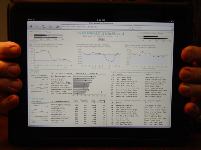 This is a SAS/Graph imitation of the dashboard on p. 201 of
Stephen Few's new book on Dashboards.
It was created using traditional SAS/Graph, with a liberal does
of "annotate" and a very liberal dose of imagination :)
The multiple graphs are placed on the same page using
SAS/Graph "proc greplay", and the html charttips and drilldowns
are via "ODS HTML".
Here are some more specifics...
The 2 "bullet charts" at the top of the page are done using
a traditional "proc gchart" hbar (horizontal bar chart).
The gray target areas behind the bars are done using
annotated (using the "bar" function). The bars have html
charttips/drilldown.
The line charts are pretty basic, with the area under the 0-line
shaded by using an annotated "bar". The points on the graph
have html charttips/drilldown, and the month abbreviations also
have charttips/drilldown (since the dots are difficult to
mouse over). The month/year labels at the bottom of the
graph were done using annotate (this allowed me to custom
place the year labels which would not have normally been
possible, and also that's what allowed the charttip/drilldown
to be added to them - neither of these would have been
possible without using annotate to replace the normal
labels).
The bar chart w/ sparkline was kinda tough...
I created the bar chart & sparkline separately, and then went
to great pains to make sure the sparklines lined up with the
right bar (even if the data changes). I think I've done it in
a pretty generalized way, and it should accept other/different
data and still line up well (as long as you don't change the
fonts, etc).
The sparkline is done using SAS/Graph "proc gplot".
Each line has an "offset" and goes through a bit of numeric
manipulation (each sparkline is basically "normalized" around
a light gray 100% line, so you have a point of reference and
an easy way to compare them - this is a slight deviation/
enhancement from the original chart in the dashboard book).
The bar chart is a normal "proc gchart" hbar, with a line
annotated to denote the %-viewed value.
The common line & labels above the sparklines & bar chart were
done using annotate, and "greplayed" into an area that covered
the areas for both of the separate charts (somewhat "tricky").
In the "Referral Sites" section (bottom/left), I just re-cycled
the code from the sparkline/bar-chart. I made the bars "invisible"
by making them the same color as the background, and the columns
of numbers are all done (programmatically) using annotate.
Note that the website names have html charttip/drilldown, and
if you click on them they take you to that website - kinda a
nice tough, I think :)
The 2 tables in the bottom/right are all annotate.
The larger Blue labels, and the blue lines between sections,
were all done using annotate.
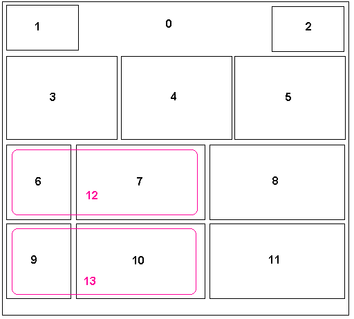
Here is a diagram of how the custom greplay template is laid out
and numbered, for this dashboard:
This is a SAS/Graph imitation of the dashboard on p. 201 of
Stephen Few's new book on Dashboards.
It was created using traditional SAS/Graph, with a liberal does
of "annotate" and a very liberal dose of imagination :)
The multiple graphs are placed on the same page using
SAS/Graph "proc greplay", and the html charttips and drilldowns
are via "ODS HTML".
Here are some more specifics...
The 2 "bullet charts" at the top of the page are done using
a traditional "proc gchart" hbar (horizontal bar chart).
The gray target areas behind the bars are done using
annotated (using the "bar" function). The bars have html
charttips/drilldown.
The line charts are pretty basic, with the area under the 0-line
shaded by using an annotated "bar". The points on the graph
have html charttips/drilldown, and the month abbreviations also
have charttips/drilldown (since the dots are difficult to
mouse over). The month/year labels at the bottom of the
graph were done using annotate (this allowed me to custom
place the year labels which would not have normally been
possible, and also that's what allowed the charttip/drilldown
to be added to them - neither of these would have been
possible without using annotate to replace the normal
labels).
The bar chart w/ sparkline was kinda tough...
I created the bar chart & sparkline separately, and then went
to great pains to make sure the sparklines lined up with the
right bar (even if the data changes). I think I've done it in
a pretty generalized way, and it should accept other/different
data and still line up well (as long as you don't change the
fonts, etc).
The sparkline is done using SAS/Graph "proc gplot".
Each line has an "offset" and goes through a bit of numeric
manipulation (each sparkline is basically "normalized" around
a light gray 100% line, so you have a point of reference and
an easy way to compare them - this is a slight deviation/
enhancement from the original chart in the dashboard book).
The bar chart is a normal "proc gchart" hbar, with a line
annotated to denote the %-viewed value.
The common line & labels above the sparklines & bar chart were
done using annotate, and "greplayed" into an area that covered
the areas for both of the separate charts (somewhat "tricky").
In the "Referral Sites" section (bottom/left), I just re-cycled
the code from the sparkline/bar-chart. I made the bars "invisible"
by making them the same color as the background, and the columns
of numbers are all done (programmatically) using annotate.
Note that the website names have html charttip/drilldown, and
if you click on them they take you to that website - kinda a
nice tough, I think :)
The 2 tables in the bottom/right are all annotate.
The larger Blue labels, and the blue lines between sections,
were all done using annotate.
Here is a diagram of how the custom greplay template is laid out
and numbered, for this dashboard:
 Back to Samples Index