Robert Allison, SAS Institute Inc
SAS Software
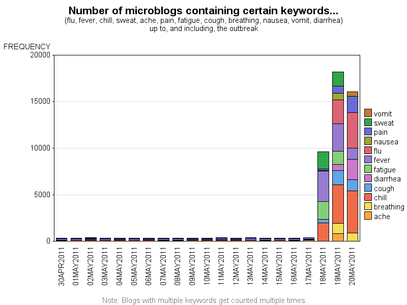
I imported all the micro-blogs from the csv into a SAS data set, and queried to subset the ones containing keywords describing flu-like symptoms (flu, fever, chill, sweat, ache, pain, fatigue, cough, breathing, nausea, vomit, diarrhea). I then created a bar chart showing the number of these micro-blogs per day, showing that they increased dramatically starting on May 18th (see bar chart below):
I then plotted the May 18th micro-blogs as red circles at their appropriate latitude/longitude locations on the Vastopolis map (I used a gray-scale version of the map, so the red markers would show up better). The map shows that the epidemic appears to have started in 3 locations Downtown: the Vastopolis Dome (left side of the dense red color), the middle of Downtown (some blogs mentioned there was a festival, and I assume this might have been the location?), and the Convention Center (right side of the dense red color, in the map below):
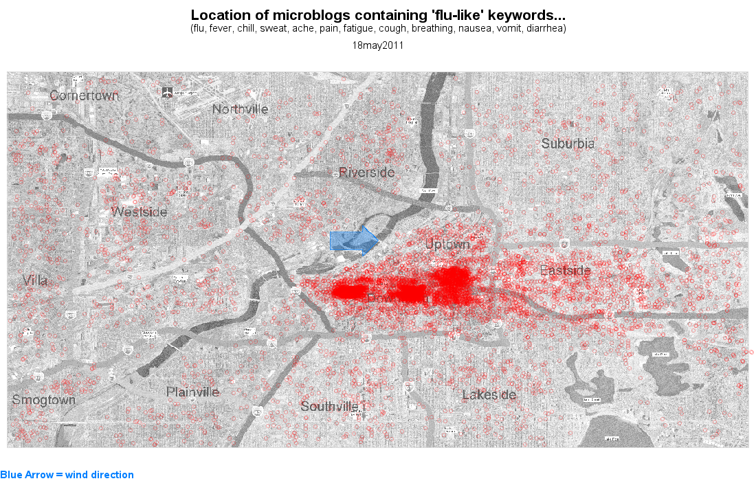
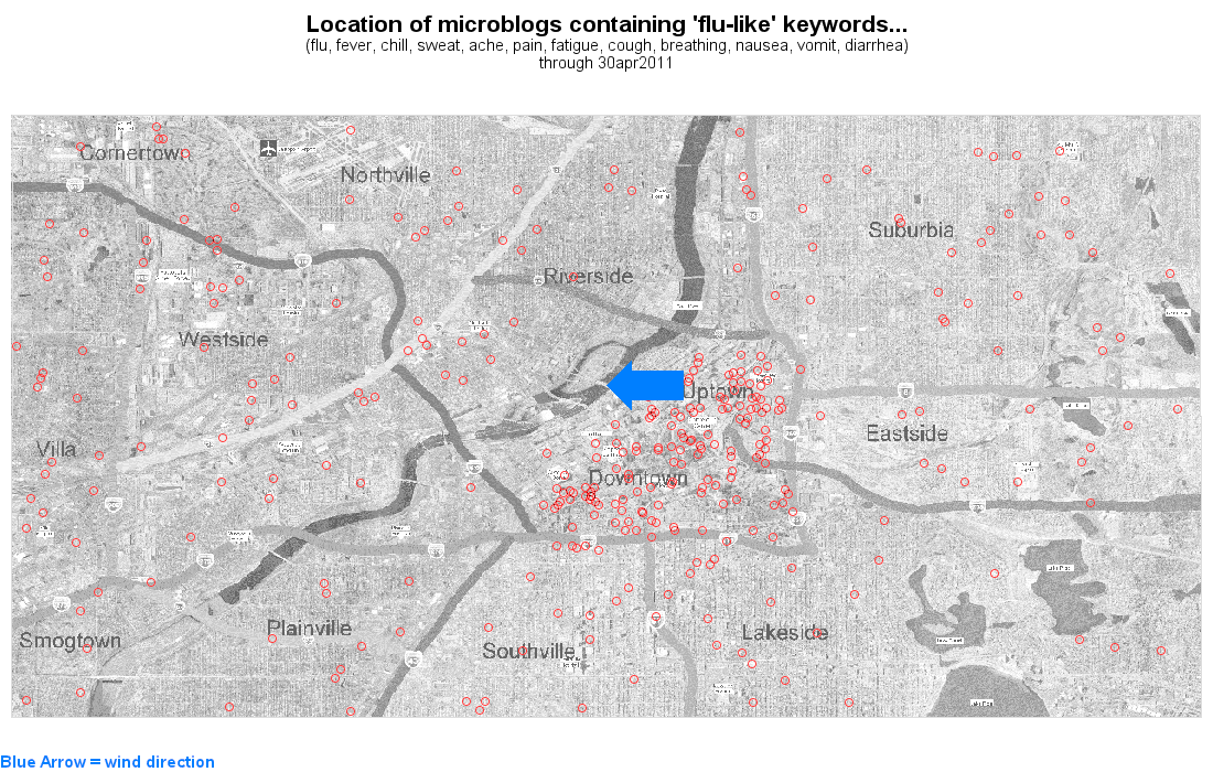
I believe that people were first exposed to the epidemic were at the Vastopolis Dome, an outdoor festival in the middle of Downtown, and at the Convention Center, on Wednesday, May 18 - possibly distributed there in the food. It might have also spread a little via the wind, into Eastside - the wind was coming from the west, as illustrated by the blue arrow. (Note this is the same map as in previous question, MC 1.1)
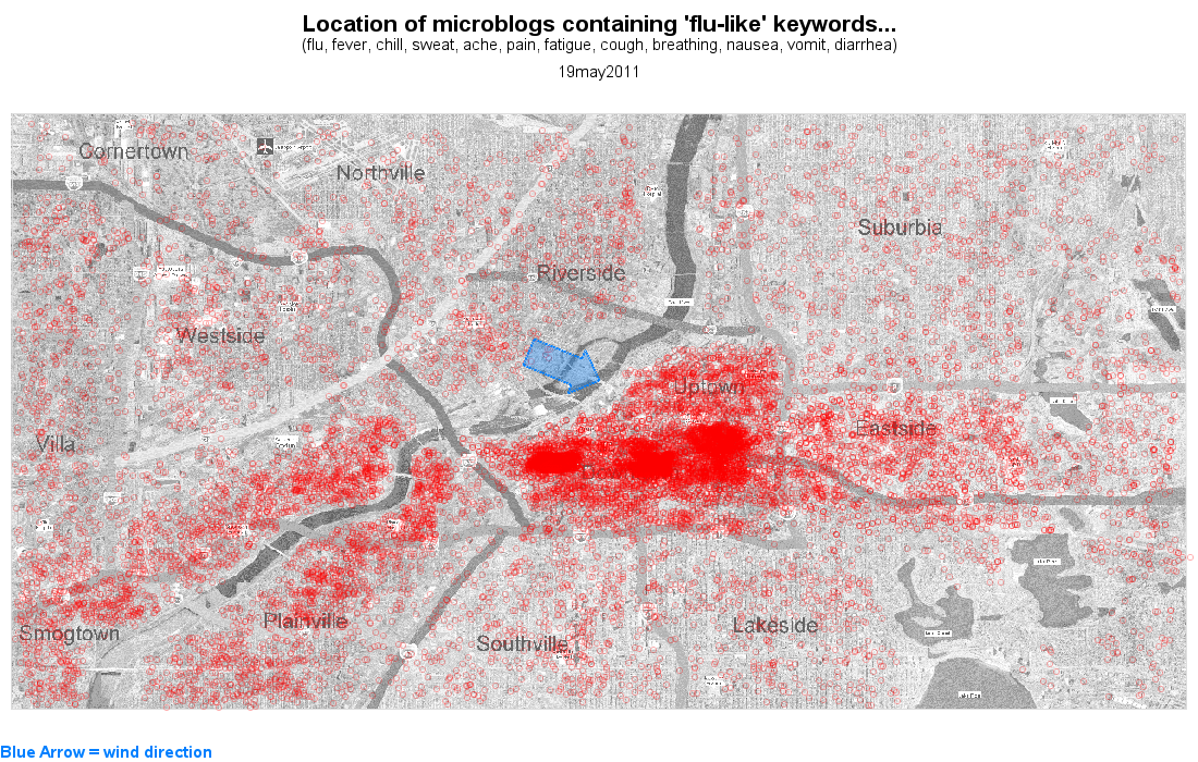
On the 2nd day of the epidemic (May 19th), the epidemic symptoms seem to extend to the SouthWest, along the river (see the higher density of red circles). This is not the direction the wind is blowing, therefore I assume that whatever is causing the epidemic can also be spread by water:
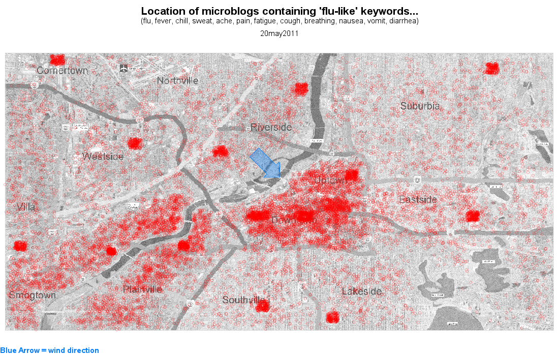
On the third day (May 20th), as people start realizing they are seriously sick, there are several "clumps" of epidemic blogs show up clearly on the map at the locations of the hospitals. Since most of the micro-blogs about symptoms are limited to the areas where people were directly infected, and then limited to the hospitals, this epidemic is probably caused by direct exposure to the contaminant, and not spread person-to-person.
And, to try to put everything in motion, and show it all at once, I have created a gif animation of all these micro-blogs (and wind direction) over time. Each successive frame of the animation represents one day, and the red circles are cumulative across all days: