Click here to see the SAS code.
Click here to see the example.

---------------------------------------------------------------

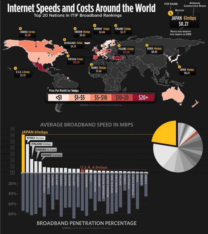
This is a SAS/Graph imitation of the following map/chart, using
the most current data I could find (year 2008).  I got the data from
spreadsheets I found on http://www.oecd.org/sti/ict/broadband

Here is their original chart I was imitating:


I opted to not use their over-and-under bar chart (with 2 different units on the y-axis,
and the bars pointing down not really being negative).

I also decided not to use the pie chart, which is redundant with the bar chart.

Theirs is a little "tighter" and more densely-packed than mine, but I think mine is a bit easier to read.

---

Code Tricks:

I use SAS/Access' "proc import" to read in the data from the spreadsheet(s).

I use if/else statements to put the map data into the desired legend buckets (1-5),
and then create a user-defined format to have those buckets show up with the
desired text label (I use macro variables to guarantee that the buckets match
the legend text).

The "trickiest" part is moving the label text on the map, and drawing a line
to it.  I create a data set so I can do this in a "data driven" manner.


Back to Samples Index
  I opted to not use their over-and-under bar chart (with 2 different units on the y-axis,
and the bars pointing down not really being negative).
I also decided not to use the pie chart, which is redundant with the bar chart.
Theirs is a little "tighter" and more densely-packed than mine, but I think mine is a bit easier to read.
---
Code Tricks:
I use SAS/Access' "proc import" to read in the data from the spreadsheet(s).
I use if/else statements to put the map data into the desired legend buckets (1-5),
and then create a user-defined format to have those buckets show up with the
desired text label (I use macro variables to guarantee that the buckets match
the legend text).
The "trickiest" part is moving the label text on the map, and drawing a line
to it. I create a data set so I can do this in a "data driven" manner.
Back to Samples Index