Click here to see the SAS code.
Click here to see the example.

---------------------------------------------------------------

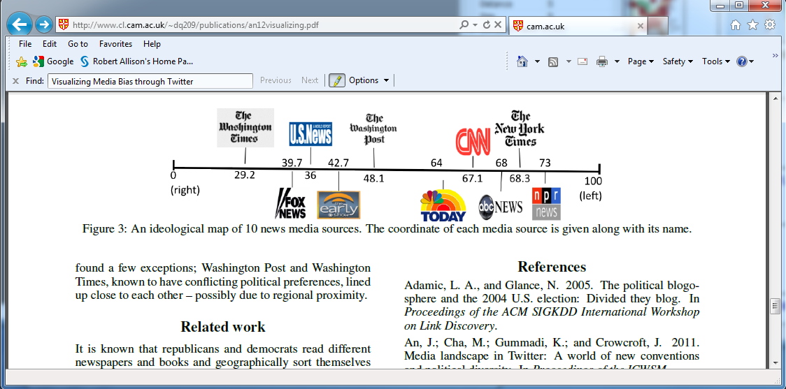
In the original graph, the "left" and "right" sides of the graph
are opposite from what they intuitively would be.  And also, the
numbers do not appear to be spread out on the scale proportionally,
but rather appear to have been place by hand, and spread out
"willy nilly", and some even appear to be in the wrong order
(such as 39.7 and 36).  See the screen-capture below:

I was a bit surprised that an aaai.org paper would have such a
technically inaccurate graph:
http://www.cl.cam.ac.uk/~dq209/publications/an12visualizing.pdf


My SAS/Graph version is not so "cute" as the original, but it
represents the numbers much more accurately.


Back to Samples Index
  My SAS/Graph version is not so "cute" as the original, but it
represents the numbers much more accurately.
Back to Samples Index