Click here to see the SAS code.
Click here to see the example.

---------------------------------------------------------------

See my blog for more information about this graph!

-----

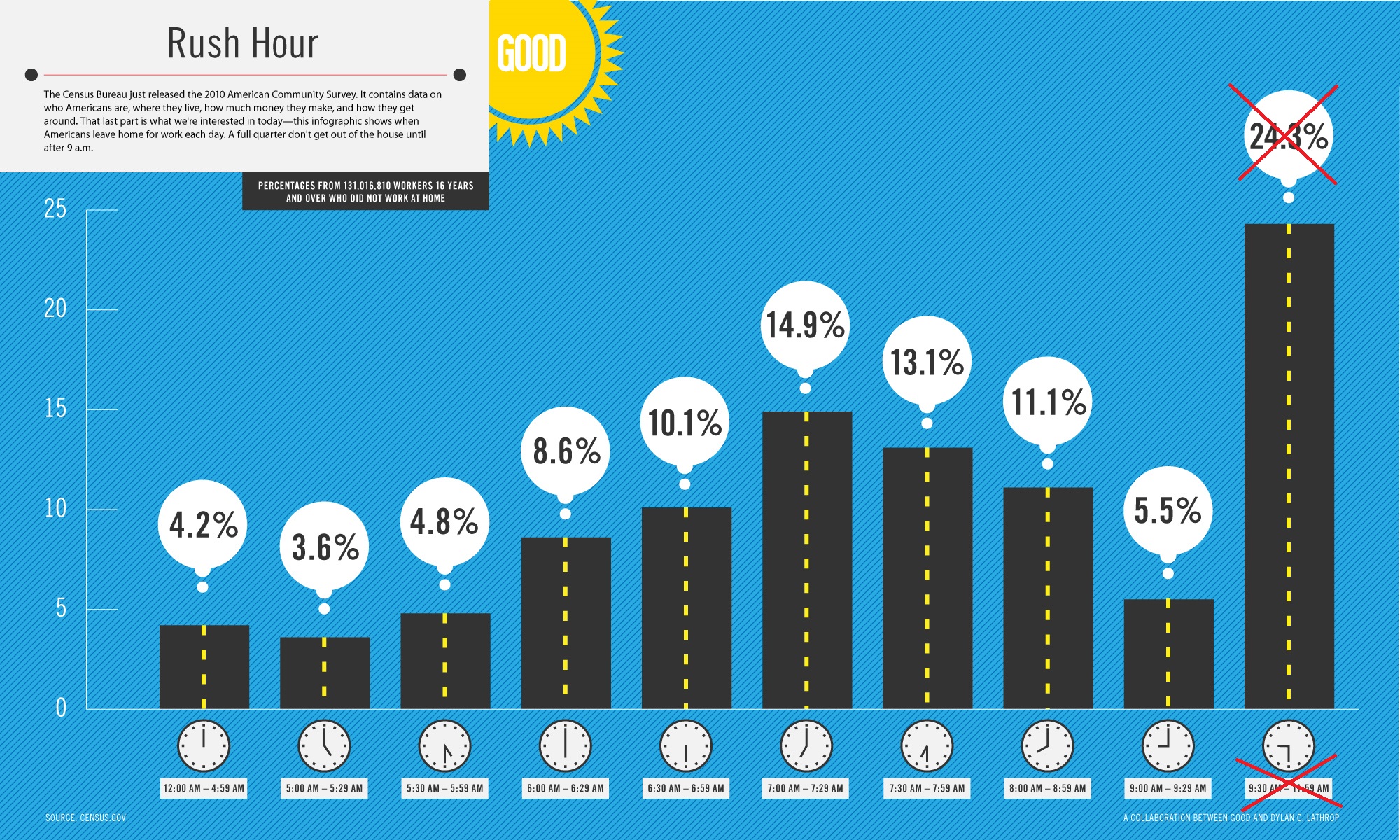
The original chart was from here:
http://www.good.is/post/infographic-out-the-door-late-americans-commute/
http://awesome.good.is/transparency/web/1109/morning-commute-times/transparency.jpg


They claimed that ~25% of people in the U.S. left for work between 9:30am-11:59am.
I thought that an amazing (suspect) claim, therefore I wanted to create my own
version of the graph, to see if it was true...

My conclusion is that their tall bar is mislabeled, and really represents 9:30am - 11:50 *PM*
(which is over 12 hours, and represents all the people working various 2nd-shift, etc).
ie, their graph is wrong & deceptive!

In my SAS/Graph version, I correctly only show the data before 11:59 *AM*,
and I also make the text on the graph big enough to read without zooming-in,
and I show the time-ranges on the clocks (rather than just showing the start time
of the range the bar represents).

-----

The 2010 data was here:
From the following link, searched for 'drive'
http://factfinder2.census.gov/faces/tableservices/jsf/pages/productview.xhtml?pid=ACS_10_1YR_S0801&prodType=table
... and then scrolled down and selected
S0802 Means of Transportation to Work by Selected Characteristics
http://factfinder2.census.gov/faces/tableservices/jsf/pages/productview.xhtml?pid=ACS_10_1YR_S0802&prodType=table
(note that the last bar in the data is 9am-11:59pm ... not 9am-11:59am)

I'm using 2009 data because it has more detailed time buckets:
http://www.census.gov/prod/2011pubs/acs-15.pdf

Back to Samples Index
  They claimed that ~25% of people in the U.S. left for work between 9:30am-11:59am.
I thought that an amazing (suspect) claim, therefore I wanted to create my own
version of the graph, to see if it was true...
My conclusion is that their tall bar is mislabeled, and really represents 9:30am - 11:50 *PM*
(which is over 12 hours, and represents all the people working various 2nd-shift, etc).
ie, their graph is wrong & deceptive!
In my SAS/Graph version, I correctly only show the data before 11:59 *AM*,
and I also make the text on the graph big enough to read without zooming-in,
and I show the time-ranges on the clocks (rather than just showing the start time
of the range the bar represents).
-----
The 2010 data was here:
From the following link, searched for 'drive'
http://factfinder2.census.gov/faces/tableservices/jsf/pages/productview.xhtml?pid=ACS_10_1YR_S0801&prodType=table
... and then scrolled down and selected
S0802 Means of Transportation to Work by Selected Characteristics
http://factfinder2.census.gov/faces/tableservices/jsf/pages/productview.xhtml?pid=ACS_10_1YR_S0802&prodType=table
(note that the last bar in the data is 9am-11:59pm ... not 9am-11:59am)
I'm using 2009 data because it has more detailed time buckets:
http://www.census.gov/prod/2011pubs/acs-15.pdf
Back to Samples Index