Click here to see the SAS code.
Click here to see the example.
---------------------------------------------------------------
See my blog for more information about this graph!
In this example, I generate a grid of dots in the space of
the projected x/y values, and then use Proc Ginside to determine
which dots are 'inside' the land areas. I keep those x/y values
(and throw away the rest) and annotate markers in those locations.
I make the actual map 'invisible' by making it the same color
as the background, and then annotate my dot markers on the
'invisible' map (now these dots are in vaguely the shape as
the land areas). This is more of an 'artistic' map, rather
than a highly technical analytic map.
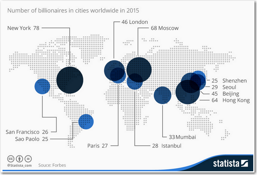
I lookup the city lat/long's in the mapsgfk.world_cities dataset,
and then annotate my red bubbles and blue labels to represent
the data values on the cities.
Here's the original map I was imitating.
Notice Shenzhen was in the wrong location, in their original map
(but I have placed it in the right location in my map):
 Back to Samples Index