Click here to see the SAS code.
Click here to see the example.
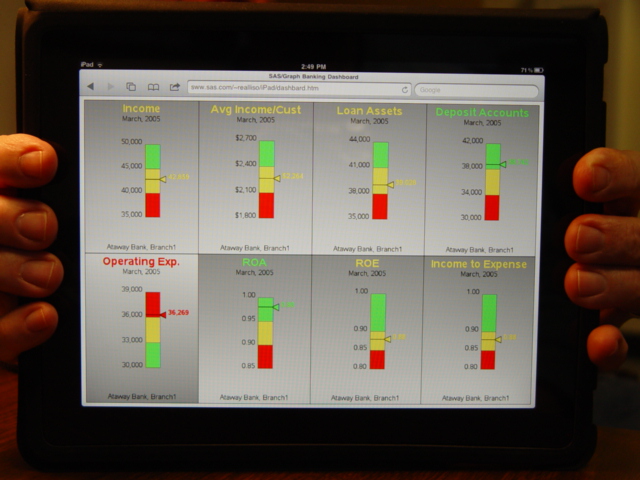 This is a 'dashboard' example, created using 'bar' charts
(rather than gauges or CSFs). ergo, the name 'DashBard'
(sounds like dashboard, but it is a dashboard that has been
innundated with bars ... ie, it's been "bar'd" -- it's
good that my graphs are better than my jokes! ;)
I started with the examples from examples on the iDashes website...
http://www.idashes.net/dash_exec_scenarios_banking.asp
The iDashes dashboard is very fancy/pretty, with cute gauges,
but people are finally starting to revolt against the 'cute'
dashboards, and lean more towards simple/functional dashboards
that only display the important information, and are simpler
and less cluttered.
I changed the iDashes data slightly, and then created my own
SAS dashboard using just simple bar charts.
First I wrote a macro that can take several parameters describing
the bar chart I want (the binning/values, the colors, the titles,
and where to locate the actual-value marker, etc. Note that this
macro gives you total control of the min/max of each bar segment
(ie, the "binning") rather than auto-scaling, or always starting
the bar at zero. This gives you total control, and also (as
demonstrated in the last 2 bar charts) you don't have to make
all the segments the same size (a nice/flexible feature, I think!)
I then create the 8 bar charts I need (saving the output in named gsegs).
And, I display them on the same page using "proc greplay" and
a custom 4x2 template. The good thing about greplay is it gives
you *complete* control over designing the template, and it also
preserves the charttip/drilldown capability.
And, for a final "nice touch", I annotate a gradient/shaded
background behind each bar chart :) Since the "Operating Expense"
chart is sort of "opposite" from the other charts (ie, a low value
is good, and a high value is bad), I reverse the gradient background
in that one.
Back to Samples Index
This is a 'dashboard' example, created using 'bar' charts
(rather than gauges or CSFs). ergo, the name 'DashBard'
(sounds like dashboard, but it is a dashboard that has been
innundated with bars ... ie, it's been "bar'd" -- it's
good that my graphs are better than my jokes! ;)
I started with the examples from examples on the iDashes website...
http://www.idashes.net/dash_exec_scenarios_banking.asp
The iDashes dashboard is very fancy/pretty, with cute gauges,
but people are finally starting to revolt against the 'cute'
dashboards, and lean more towards simple/functional dashboards
that only display the important information, and are simpler
and less cluttered.
I changed the iDashes data slightly, and then created my own
SAS dashboard using just simple bar charts.
First I wrote a macro that can take several parameters describing
the bar chart I want (the binning/values, the colors, the titles,
and where to locate the actual-value marker, etc. Note that this
macro gives you total control of the min/max of each bar segment
(ie, the "binning") rather than auto-scaling, or always starting
the bar at zero. This gives you total control, and also (as
demonstrated in the last 2 bar charts) you don't have to make
all the segments the same size (a nice/flexible feature, I think!)
I then create the 8 bar charts I need (saving the output in named gsegs).
And, I display them on the same page using "proc greplay" and
a custom 4x2 template. The good thing about greplay is it gives
you *complete* control over designing the template, and it also
preserves the charttip/drilldown capability.
And, for a final "nice touch", I annotate a gradient/shaded
background behind each bar chart :) Since the "Operating Expense"
chart is sort of "opposite" from the other charts (ie, a low value
is good, and a high value is bad), I reverse the gradient background
in that one.
Back to Samples Index