Click here to see the SAS code.
Click here to see the example.
---------------------------------------------------------------
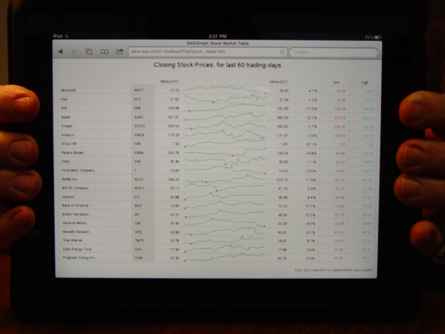 For each stock, I run it through a macro.
The macro goes to a website and reads in the data for that stock, and appends it to a data set.
Once the data for all the stocks is read, I 'normalize' the data for each stock,
scaling it from the min-to-max, and progressively apply a bigger 'offset'
to each stock's line, so each line is drawn separate.
I use the 'offset' option on the axis statement to add a lot of white-space to the
left and right of the lines, and I annotate various pieces of text & numbers into that space.
I also annotate some lines, etc, to make it look like a table.
And, for a nice touch, I count how many items you're plotting, and dynamically
control the up/down size (goptions ypixels=), based on the number of lines plotted.
Back to Samples Index
For each stock, I run it through a macro.
The macro goes to a website and reads in the data for that stock, and appends it to a data set.
Once the data for all the stocks is read, I 'normalize' the data for each stock,
scaling it from the min-to-max, and progressively apply a bigger 'offset'
to each stock's line, so each line is drawn separate.
I use the 'offset' option on the axis statement to add a lot of white-space to the
left and right of the lines, and I annotate various pieces of text & numbers into that space.
I also annotate some lines, etc, to make it look like a table.
And, for a nice touch, I count how many items you're plotting, and dynamically
control the up/down size (goptions ypixels=), based on the number of lines plotted.
Back to Samples Index