

V9.2 SAS/Graph has a lot of changes - hopefully you'll love them all!
But, if you're a SAS/Graph power-user, and you have written sas jobs with graphical output that's already exactly the way you like it, some of these v9.2 changes could cause some of your old SAS/Graph jobs to run "differently" in v9.2 (which might be undesireable). The purpose of this paper is to help you understand the changes, so that you can make an informed decision as to which of the changes you would like to embrace, and which you might need to over-ride.
Note: This paper does not cover all the changes & enhancements in v9.2 SAS/Graph ... only the ones that I think might cause your old/legacy SAS/Graph jobs to run differently.
Note: The examples in this paper were intentionally crafted to trigger the v9.2 changes/differences in the worst & most-extreme way, so that you can easily see the differences. You will hopefully not see changes quite this dramatic in your output.
Prior to v9.2, if you created a graph using ODS HTML, writing the results to a file, the default was device=gif. In v9.2 the new default is device=png. The results should look very similar, but if you have scripts or URLs that refer to the .gif filename, you will need to change them to point to the .png filename instead. Right-click on the 'proc gslide' examples below, and view the "properties" and you'll see the difference (gif & png). If this causes a problem for you, you can hard-code your sas jobs to specifically use gif rather than taking the new png default, by specifying "goptions device=gif;" (click here to see the sas code)


Prior to v9.2, SAS/Graphs used the SAS/Graph software fonts as the default font. The SAS/Graph software fonts are not rendered with smooth (anti-aliased) edges, and can look somewhat 'jagged' along the edges. The reason the sas/graph software fonts were used as the default (as opposed to some of the nicer truetype and other fonts that might be on your system) is that they are guaranteed to always be there in your sas install, and they are guaranteed to look the same on all hosts (Windows, Unix, Mainframe, etc).
Prior to v9.2, it was difficult to write SAS/Graph programs which would run on all operating systems, and produce nice-looking fonts. For v9.2, sas bought re-distribution rights for several nice-looking fonts from the font foundry called 'Monotype Imaging' (the term 'foundry' comes from the days of old when companies actually used lead to make the font characters). The new fonts should make it much easier to produce nice-looking graphs on Unix & Mainframe systems, and also make it easier to re-use the exact same sas code on Windows, Unix, and Mainframes, without having to change the font. Albany AMT is used as the default graph font in most cases in v9.2 (this font looks almost exactly like the Windows Arial font). If these new font defaults cause a problem for you, you can hard-code your sas jobs to use the old SAS/Graph software-fonts via the goptions, such as ... "goptions ftitle=swiss ftext=simplex;" (sas code)


In conjunction with the new default fonts, v9.2 sas also changed the default font rendering technique from Host font rendering to Freetype font rendering. While making this change, developers also fixed a bug that had previously caused fonts to render slightly smaller than the specified font-size ... now in v9.2 the fonts are rendered in the correct size (slightly larger than in prior versions). If the spacing of the text in your graphs is very tight (especially in bar charts), this change might sometimes (not usually, just in extreme cases) cause the axis text values to no longer fit in v9.2, which might cause them to auto-rotate (as shown in the example below). If this causes a problem for you, you can use "options fontrendering=HOST_PIXELS;" with device=GIF to have the text rendered in the same size it was prior to v9.2. Or, you could use device=ZGIF which automatically uses fontrendering=HOST_PIXELS. (sas code)
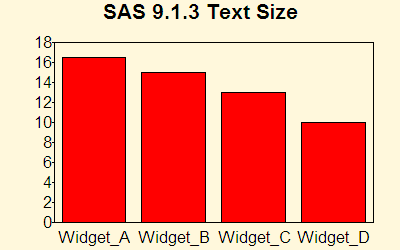
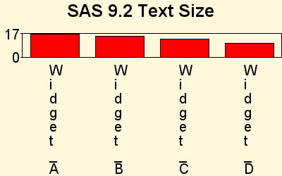
Prior to v9.2, when 'host font rendering' was the default, if you installed more fonts on your pc after sas was installed, you could automatically use those fonts in SAS/Graph. But since freetype font rendering is the default in v9.2, if you install fonts on your pc after the sas install, then you'll have to manually "register" these fonts into the sas registry by running "proc fontreg" (such as ... PROC FONTREG; FONTPATH "C:\WINNT\Fonts"; run;) before using them in a SAS/Graph. If this causes a problem for you, you can use "options fontrendering=HOST_PIXELS;" to get the pre-v9.2 behavior.
Prior to v9.2, SAS/Graph devices such as gif and png only supported the ODS border around the graphs for the graph styles - the graph styles didn't affect the text, colors, or the 'look' of the graph -- only the activex and java SAS/Graph devices changed the look of the graph based on the style. In v9.2, all devices support the SAS/Graph styles, including gif and png.
The new SAS/Graph styles (such as torn, astronomy, seaside, meadow, banker, and watercolor) are an easy way to choose pleasing color combinations for the background, the text, the axes, and the chart elements (such as bars, plot lines, map areas, etc). They also control the font of the text, and some come with a decorative background image. It is very unlikely that you will have specified one of these new styles in your non-java/activex legacy sas jobs, but if you did then they will now have a dramatic visual effect on your graphs (whereas previously they would have had no effect). (sas code)
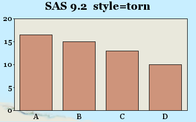
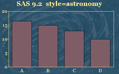
Even the 'old' styles (such as d3d, brick, and minimal) which only affected the html border around the gif & png graph prior to v9.2, now affect the default chart colors in v9.2.
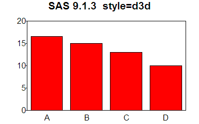
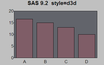
If you have specified goptions and/or various proc options in your sas jobs (as most SAS/Graph Power-Users tend to do), then those specific options will override the graph styles, and those aspects of your graphs will look the same as they did before. For example, goptions ftitle & ftext override the style's font. Goptions cback=white overrides the background color. Gchart & Gmap's coutline= overrides the style's outline color for the bars & map areas. Gplot's cframe=white overrides the style's frame color (inside the axes). Hardcoded symbol or pattern statements override the style's default colors for bars, lines, and map areas. And you can specify goptions iback=' '; to override the style's background image. If the new styles cause a problem for you, use "options nogstyle;" to totally get rid of the styles and get the pre-v9.2 behavior.
This is actually part of the v9.2 graph styles, but an important enough topic that I thought I'd give it its own section. Prior to v9.2, if you didn't specify colors in your pattern statements, the default color list was used (which contained the basic/primary colors), and after the color list was exhausted, the same colors were re-used with various cross-hatch patterns. In v9.2 (with the new graph styles) the default color lists are much longer, and generally contain non-primary colors - once the color list has been exhausted in v9.2, the various shades of the color list are used rather than cross-hatch patterns of the same colors. The specific colors vary, depending on which graph style is being used. (sas code)
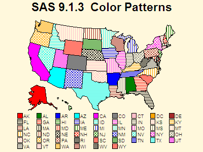
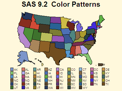
You can override the new v9.2 default color patterns by specifying pattern statements, with specific colors, for each & every pattern you need, rather than letting your charts use the default colors. If the new pattern colors cause a problem for you, use "options nogstyle;" to totally get rid of the styles and get the pre-v9.2 pattern color behavior.
Prior to v9.2, SAS/Graph had a limit of 256 colors. The 256 colors are not only consumed by the colors you specify, but also the shades of colors that are needed for anti-aliasing the edges of fonts, gradient shading on the sides of 3d cylinder-shaped gchart bars, images you include in the graph, etc. When you run out of colors, the results are a bit "unpredictable".
In v9.2, SAS/Graph has been enhanced so that it supports over 16 million colors. This increase in colors is only supported in certain SAS/Graph devices (such as device=png). Device=gif, for example, will never support >256 colors in SAS/Graph, because the gif standard itself does not support >256 colors.
With more colors, your output can look better, because more shades are available for better text anti-aliasing (edge smoothing), and also when images/photos are incorporated into graphs they have a more true/undithered look, as demonstrated in the example below. (sas code)
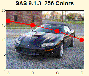
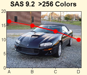
I can't imagine this enhancement causing any undesireable changes in your output, but if you need your output to be exactly like it was in v9.1.3, or if you want to limit yourself to 256 colors, you can hardcode "goptions device=gif" rather than taking the new dev=png v9.2 default.
In previous versions of sas, maps.us only contained the 50 states of the United States, and Washington, DC. In v9.2, the decision was made to also include Puerto Rico in maps.us. This can affect your pre-existing jobs in several ways ... For example, if you were shading all 50 states & DC by specifying a repeat=51 in a pattern statement, you now have 52 map id's rather than 51. Also, if you were getting a map of the continental US by excluding Alaska & Hawaii, you now have to also exclude Puerto Rico. (sas code)
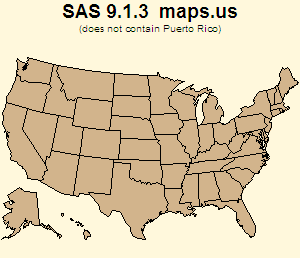
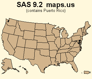
If you want to use the new v9.2 maps.us, and exclude Puerto Rico, you can use something like this in your gmap statement: proc gmap map=maps.us (where=(state^=stfips('PR'))) - If you want your jobs to run exactly like they used to, without having to modify your code, you will need to replace your v9.2 maps.us with your old v9.1.3 maps.us (the file name is us.sas7bdat).
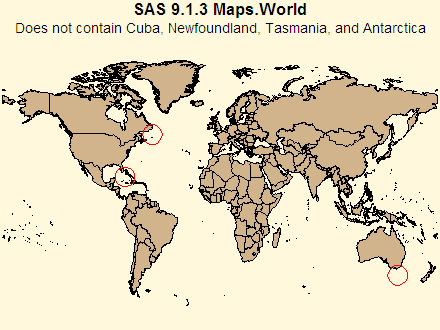
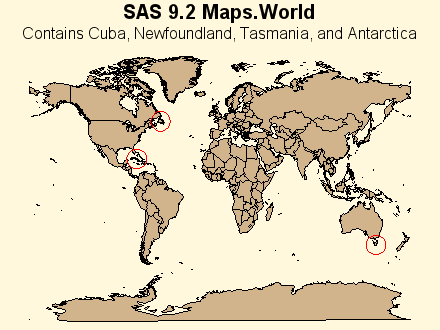
There have been several changes to MAPS.WORLD - For example, Cuba, Newfoundland, Tasmania, and Antarctica have been added. I doubt that the addition of Cuba, Newfoundland & Tasmania will cause much problem for your legacy SAS/Graph jobs, but the addition of Antarctica will cause huge changes in the look & spacing of your map. If you want to use the new v9.2 map, but exclude Antarctica, then you can manually exclude it with a where statement such as ... where (cont ^= 97). As always, you can use your old v9.1.3 world.sas7bdat in v9.2 sas so that your map will look exactly the same as it did before. (sas code)
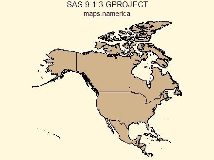
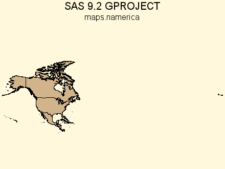
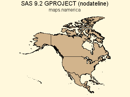
There have been some changes to proc GPROJECT (and also to the maps themselves) that might cause some of your maps to look differently in v9.2. In particular, maps that cross the international date line. This example shows the difference in maps.namerica (North America). To get the v9.1.3 behavior, you'll need to specify the new GPROJECT 'nodateline' option in your v9.2 sas jobs. Also, in certain situations where you want to create a custom map that spans the dateline, you might need to use the undocumented NORANGECHECK gproject option. (sas code)
There have been several other changes to various SAS/Graph maps in v9.2 that might cause your legacy jobs to run differently - for example, new province names & id numbers in China, Spain, and India (see the v9.2 "What's New" doc for a complete list of changes to all the maps). In most cases, the old id numbers were somewhat arbitrarily assigned, and the new id numbers attempt to use international standards for the province numbers, etc. This should make it much easier and more logical to associate your data with map areas in your future maps, but will unfortunately break your legacy maps. (sas code)
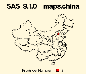
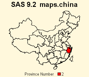
You will need to check these lists for changes affecting the maps you use - otherwise when you run your SAS/Graph jobs at v9.2, the output could be incorrect (for example, if the id numbers change, and correspond to different areas in v9.2, the data/colors/patterns/bars will be showing up on a different area in v9.2 ... which will be wrong.) To guarantee your jobs will run the same in v9.2 as they did before, you will need to use the old/v9.1.3 maps, or modify your sas jobs and/or response data to correspond with the id's in the new maps.
The NAME= option for SAS/Graph procedures has been enhanced to allow you to specify filenames up to 256 characters (previous limit was 8 characters) for graphics output files (PNG files, GIF files, and so on). Right-click on the examples below, and view the 'properties' to see the gif filenames. (sas code)


Your legacy SAS/Graph jobs will likely not be affected by this change, unless you were previously specifying names longer than 8 characters, which were previously being truncated - and in v9.2 they will not be truncated. And in this scenario, if you had scripts or URLs that referred to the gif output file by name, then you'll need to update them to refer to the longer name.
Another issue - in v9.2 the grseg name is still limited to 8 characters - therefore if you specify a name= longer than 8 characters, the grseg and the filename will no longer match. This isn't likely to cause problems for your legacy SAS/Graph jobs per-say, but it could cause some 'confusion' for the programmer who was accustomed to seeing the names match in previous versions of sas.
There is no way to get the previous filename-truncation behavior in v9.2.