
This paper is still under construction...
In general, there are many rules-of-thumb and "best practices" for graphs. This paper discusses some special cases that might be 'exceptions' to these general rules ... or what I'll term (tongue in cheek) Exceptional Graphs! Not that these are exceptionally great graphs, just exceptions to the general rules! :)
Let me stress again - these are exceptions to the general rules of good graphics, and I am not encouraging their use in general!
by Robert Allison
Originally written August, 2007 (updated a few times after that)
A lot of companies these days are promoting the use of fancy graphs that use various kinds of animations (such as Flash, Java, or Gif Animations) which make their graphs appear to dance across the screen or fade in from the side, or make the needle in a gauge bounce around and then snap into place, etc. Most of these animations add no value to the usefulness of the graphs or the understanding of the data. The technical term for this kind of animated graph is dancing bologna.
Here is an example of dancing bologna graphs. I'm not trying to single out any particular companies - I just picked this one because they have a lot of animated graphs in the demos on their webpage. Try viewing several of these examples, and see if you find any where the animations actually add value:
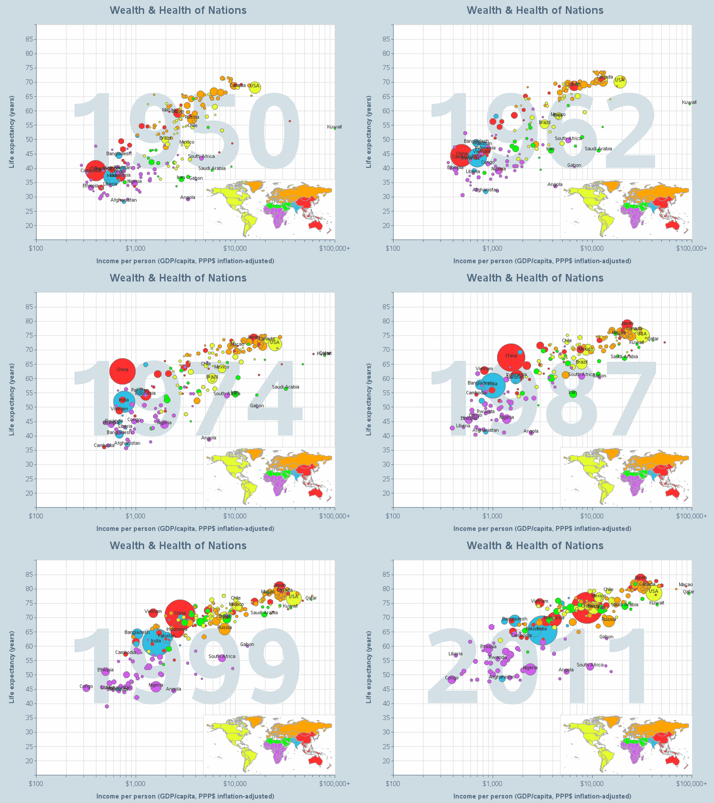
I would recommend not using animations in your graphs as the general rule, but almost every rule has exceptions. One exception to this rule would be when you're using the animation to show trends in the data over time. In this case, a good animated graph can help the user see how the data changes over time, and possibly identify trends (or the lack thereof). Here is an example - my version of Hans Rosling's famous animation:
Gauges are commonly overused - especially in graphics dashboards, where the word 'dashboard' makes the designer think they should use gauges since gauges are common in a car's dashboard. In reality, gauges are usually a poor choice for communicating data, and consume more space than many other types of graphs (usually, other graphs communicate the data better and consume less space). Here are some examples where gauges are generally a poor choice, and often misused:
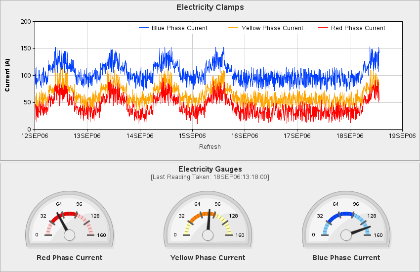
Although the general rule would be to not use gauges, here is an exception where I think gauges make sense. This example shows some electrical utility data in a plot over time, and then the final values are shown in the 3 gauges under the graph. The people working at the utility company are accustomed to seeing the data on an actual/physical gauge, and this representation of the same gauge on the computer screen is therefore very easy for them to relate to.
In general, the response axis in a bar chart should always show zero, and the bars should be drawn starting at zero, so that the heights of the bars give a fair (proportional) comparison of the quantities represented by the bars.
This is probably the 1 section of my paper that will cause the most controversy and disagreement! The graphics purists will say that there should never be an exception to this rule. And I will probably "burn in graphics hell" for this, but I'm going to try to argue that there 'might' (notice I only said might!) be a few situations where it might be ok to have bar charts that do not start at zero.
One type of data that might be considered an exception to this general rule is 'temperature'. Temperature is not per-say a quantity, and maybe shouldn't be represented using a bar chart at all, but we are all used to seeing temperature measured on a thermometer. I guess a thermometer is technically a 'meter' and not a bar chart, but if we create a bar chart with a single bar, it certainly looks similar to a thermometer.
So, now that we've decided to represent temperature on a bar chart, how do we draw the bars? Do we start drawing them at zero degrees? Maybe that depends on whether we're representing Celsius or Fahrenheit degrees? Can temperatures go below 0-degrees, and if so, do we want to show it as a bar extending in the negative direction from zero? Real thermometers don't generally start at zero, and don't have <0 temperatures going in the negative direction. Therefore, similar to a real thermometer, if I were to represent temperature on a bar chart, I would make the minimum value of the axis correspond to the minimum temperature I want to represent, and start the bar there. I guess maybe 'technically' this makes it not a bar chart per say (maybe we should call it a 'thermometer chart', if there is such a thing), but certainly in the family of bar charts, and makes a good argument for maybe not starting all bars at zero.

Another exception might be for data such as stock market data, where the day-to-day changes are usually such a small percentage of the whole, that it is usually 'uninteresting' to show the data plotted with a zero baseline. In this case, I find it useful to plot the data both ways - with a zero baseline, and also with a clipped axis showing only the 'interesting' movement in the data. Here is an example - not per-say your traditional 'bar' chart, but the weekly shaded areas under the line give the visual impression of 'bars'. This is pretty much standard practice in stock market plots and charts, and although the novice reader might misread a chart that doesn't start at zero, the savvy/expreienced users are keenly aware of what they are looking at, and how to interpret the different axes.


I almost always avoid 3d bar charts, because even at their best they make the data harder to read/comprehend in the graph (and at their worst, they can easily cause the data to shown in such a deceptive manner that shorter bars actually look longer than taller bars, or vice versa).
But, with web/drilldown bar charts, I have found one scenario where 3d bars can be useful... If you have a zero-height (or very short) bar, there is not enough of a bar to click/drilldown on. For example, in the 2d bar chart below, there's nothing to click on for the Virginia (VA) bar.
In this case, a 3d bar can let the user easily click on the 3d cross-section of the zero-height bar. (Ok, I do "cheat" a little here ... if the value is exactly zero, the bar chart doesn't show a cross-section, so I make the value *near* zero, and then use a format so the charttip shows the value as zero, without all the decimal places - it's ok to cheat a little in graphics, as long as it's for good, not evil! ;)
Many of the graphing packages make it very easy for users to create 3d graphs - this looks "flashy", and therefore many novice graph users choose to go that route. But this is usually a bad choice, because a 2d (flat) view of a 3d graph makes it almost impossible to determine where the data values fall against the axis scales, and to compare the various object (such as bars) shown in the graphs. In general, it is much easier to analyze and comprehend data that is plotted in a simple 2d plot (or a series of 2d plots). Below are some links to examples of 'bad' 3d plots...
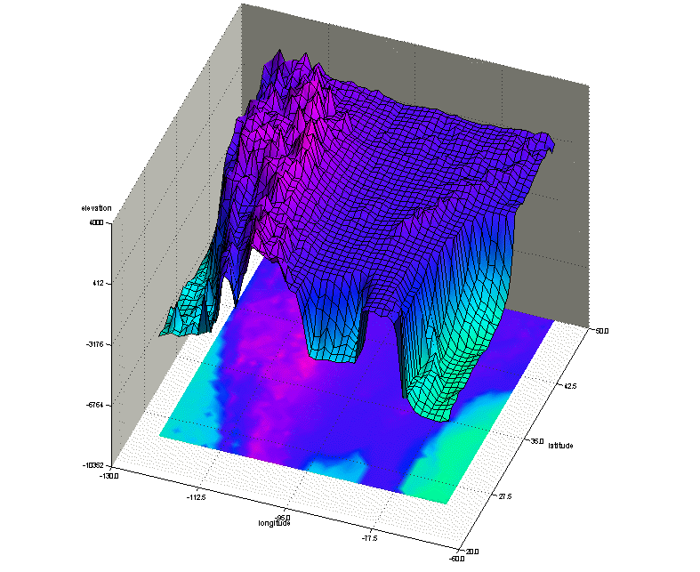
There are certain times when a 3d plot is warranted. One such situation is when your data really is "3d" in nature, and you want to visualize it in the most true-to-life form. Here is a visualization that shows longitude/latitude/elevation data for north america - in cases like this, it is reasonable to display the data using 3d graphics.
As a general rule, you probably shouldn't use stacked bar charts. Invariably, almost every time I use stacked bar charts, I find myself wanting to compare the values of the stacked bar segments - and there's just no easy way to do that when the bar segments are stacked.
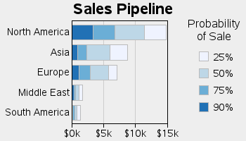
But in certain situations, the stacking of the bar segments can provide a natural/intuitive arrangement of the data, which actually helps the user comprehend the data. One example that I thought was clever is using stacked bar segments, in decreasing gradient shading, where the gradient represents the likelihood of sales. The "solid/certain" sales are in the solid color and nearest the base of the stacked bar, and each progressive bar segment represents a less likely sale in a lighter gradient shade, as in the example below. This way, the bar chart's segments and the gradient shading work in combination to give complementary visual cues that work together.
In general, it is usually more difficult for people to compare angles in a pie chart, than to compare heights of bars - therefore it is usually preferable to use bar charts rather than pie charts.
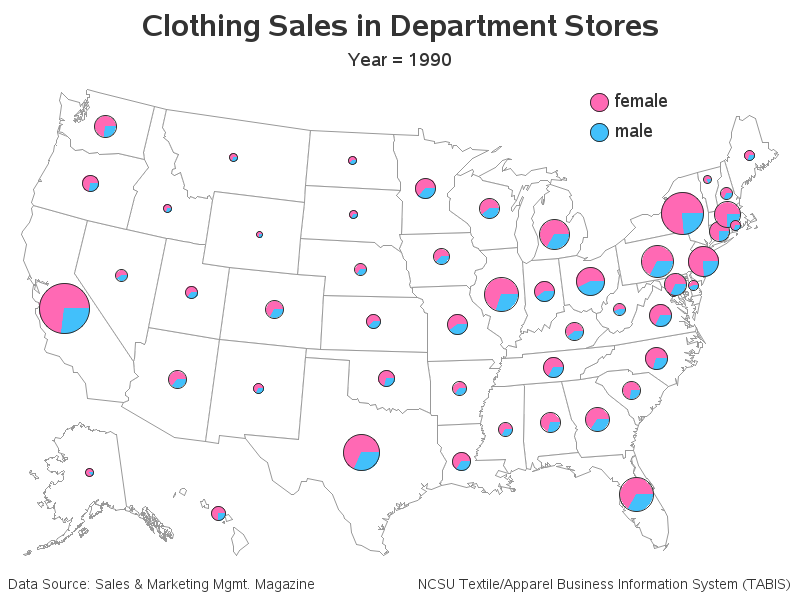
One situation where a pie is not so bad is comparing one value to the whole, or comparing 2 values (which is essentially the same as comparing one value to the whole). This example uses pie slices to compare the male and female clothing sales. It is easy to see, at a glance, that the females consistently have more clothing sales than men. This particular map would have been especially difficult to create using bar charts, because I'm using the total area/size of the pies to represent the total expenditure in each state, allowing users to quickly compare the male/female sales, as well as the total sales in each state.
Back to Samples Index