Click here to see the SAS code.
Click here to see the example.

---------------------------------------------------------------

My version of graph from:
http://support.sas.com/resources/papers/proceedings13/309-2013.pdf

** Note that in the paper they hard-code annotated 'needle' lines, and one of
the colored markers, and the legend (and mention that this is a disadvantage
of using Gplot rather than the new SG stuff).  But this example shows that
those things can be done in a data-driven way in Gplot, without hard-coding
the annotation!

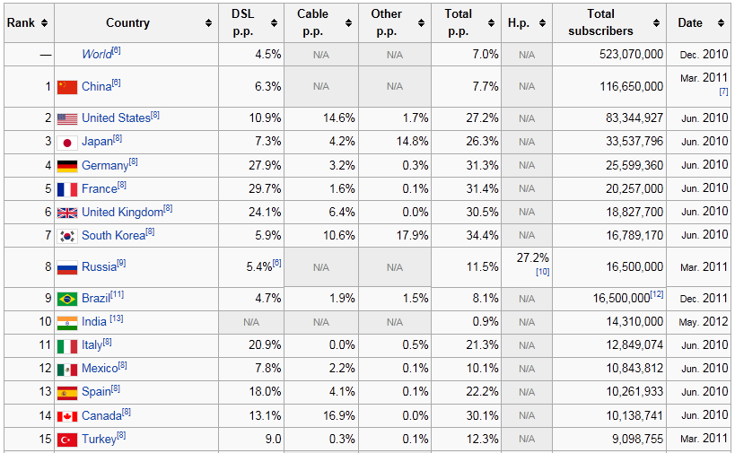
Using data from:
http://en.wikipedia.org/wiki/List_of_countries_by_number_of_broadband_Internet_subscriptions


Back to Samples Index
  Back to Samples Index