Click here to see the SAS code.
Click here to see the example.

---------------------------------------------------------------


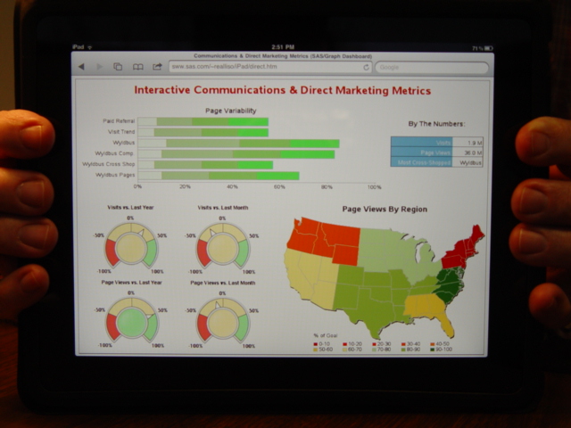
This dashboard is an imitation of the following VisualMining dashboard.

Not to say I think it's a "great" dashboard, but just wanted to show/prove that
SAS/Graph can do dashboards like our competitors.

To get the gauges in this dashboard, I'm using the new v9.2 "proc gkpi".
I save the output of the gauges as png files, and then "annotate" them
onto a gslide, and then greplay the gslide onto the dashboard.
Note that you must be *very* careful in picking the xpixel/ypixel size
of the kpi charts, and then the size of the gslide & greplay you're
using them in, in order for them to look good & legible (if your
sizes don't match up well, the kpi's will be stretched out of
proportion, and the text can easily be un-readable).

A somewhat round-about way to get it done, but that's the way
it is right now...

The bar chart & gmap are pretty standard, and the table is created
using annotate, so that it's a "graphic" grseg, so I can position it
in my dashboard with greplay.

Note that the graphs & maps have charttips & drilldowns, so they are 'Interactive',
as the title implies.

---

Some defeciencies of this dashboard ...

It appears, based on the titles, that the gauge charts are being used to compare
the current values -vs- historical values ... line or bar charts would probably
be better suited for that.

Also, it is unclear what the shading of the segments in the bar chart stand for.

And, the colors in the charts & map are very similar, although they don't
really appear to be related.

Back to Samples Index
  This dashboard is an imitation of the following VisualMining dashboard.
Not to say I think it's a "great" dashboard, but just wanted to show/prove that
SAS/Graph can do dashboards like our competitors.
To get the gauges in this dashboard, I'm using the new v9.2 "proc gkpi".
I save the output of the gauges as png files, and then "annotate" them
onto a gslide, and then greplay the gslide onto the dashboard.
Note that you must be *very* careful in picking the xpixel/ypixel size
of the kpi charts, and then the size of the gslide & greplay you're
using them in, in order for them to look good & legible (if your
sizes don't match up well, the kpi's will be stretched out of
proportion, and the text can easily be un-readable).
A somewhat round-about way to get it done, but that's the way
it is right now...
The bar chart & gmap are pretty standard, and the table is created
using annotate, so that it's a "graphic" grseg, so I can position it
in my dashboard with greplay.
Note that the graphs & maps have charttips & drilldowns, so they are 'Interactive',
as the title implies.
---
Some defeciencies of this dashboard ...
It appears, based on the titles, that the gauge charts are being used to compare
the current values -vs- historical values ... line or bar charts would probably
be better suited for that.
Also, it is unclear what the shading of the segments in the bar chart stand for.
And, the colors in the charts & map are very similar, although they don't
really appear to be related.
Back to Samples Index