Click here to see the SAS code.
Click here to see the example.

---------------------------------------------------------------


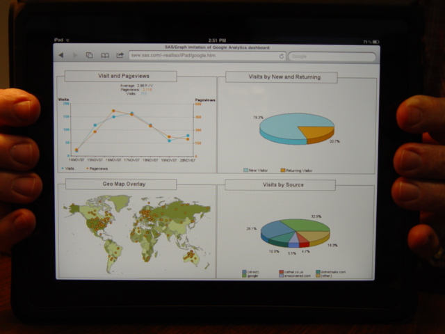
This is my SAS/Graph imitation of a "Google Analytics" dashboard.
Here is a link to the specific google analytics dashboard I was
imitating.

The top/left graph is a "proc gplot", with a "plot2" added in,
and custom legend placement via the legend statements.

The right two pie charts are created with "proc gchart",
using "pie3d".

The bottom/left map is created using a "proc gmap" choro map,
and the new v9.2 gradient shading of the map areas via a
graph style.  The dots are annotated onto the map.
The shading of the countries doesn't necessarily mean
anything (in this example), but it helps distinguish the
borders of the countries (rather than drawing a heavy/dark
border around them).

The background and title boxes at the top of each graph
are done using annotated 'bar' and text labels.

And the 4 graphs are placed on the same page using
"ods htmlpanel".

Back to Samples Index
  This is my SAS/Graph imitation of a "Google Analytics" dashboard.
Here is a link to the specific google analytics dashboard I was
imitating.
The top/left graph is a "proc gplot", with a "plot2" added in,
and custom legend placement via the legend statements.
The right two pie charts are created with "proc gchart",
using "pie3d".
The bottom/left map is created using a "proc gmap" choro map,
and the new v9.2 gradient shading of the map areas via a
graph style. The dots are annotated onto the map.
The shading of the countries doesn't necessarily mean
anything (in this example), but it helps distinguish the
borders of the countries (rather than drawing a heavy/dark
border around them).
The background and title boxes at the top of each graph
are done using annotated 'bar' and text labels.
And the 4 graphs are placed on the same page using
"ods htmlpanel".
Back to Samples Index