Click here to see the SAS code.
Click here to see the example.

---------------------------------------------------------------


SAS/Graph imitation of ...

   http://demos4.dundas.com/Musikasa/

which I found via the following website:

   http://www.dashboardinsight.com/dashboards/


As with most of my SAS/Graph dashboards, where I need very precise control of the layout,
I'm using "proc greplay" to position several SAS/Graph outputs on 1 page...

First, I use a blank "proc gslide" (with no titles or footnote) to create the main
layout of the page.  I annotate the "musikasa" banner image along the top, and
I annotate the text for the 3 main sections of graphs.

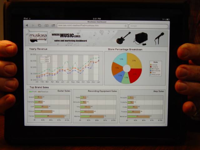
The top/left graph is a "proc gplot".
The only thing really special here is programmatically annotating the alternating
light/dark (ala "green bar paper") ranges in the background.  They help you quickly
identify which month you're in.

The top/right graph ia a "proc gchart", using "donut" instead of "pie".
I leave the slices in the default alphabetic order (since the original chart
wasn't in numeric order), but you could easily use the 'ascending' or 'descending'
option to order the slices in a more meaningful manner.

The 3 bottom graphs are "proc gchart" hbar's.
I programmatically annotate the alternating light/dark ranges behind the graph.
I also annotate the green 'profit bar', and the numbers at the ends of the bars.
And, since I annotate the green bars, I also have to annotate the legend.

All of the pieces of the graphs have html charttips/drilldowns (and the top two
graphs even have 'html_legend' charttips/drilldowns.  The drilldown is to a generic
page (if I had more detailed data, I could have created more detailed dashboards
or graphs to drill down to ... but since I didn't I just set up the generic drilldown
to show that drilldown was possible!)

Back to Samples Index
  SAS/Graph imitation of ...
http://demos4.dundas.com/Musikasa/
which I found via the following website:
http://www.dashboardinsight.com/dashboards/
As with most of my SAS/Graph dashboards, where I need very precise control of the layout,
I'm using "proc greplay" to position several SAS/Graph outputs on 1 page...
First, I use a blank "proc gslide" (with no titles or footnote) to create the main
layout of the page. I annotate the "musikasa" banner image along the top, and
I annotate the text for the 3 main sections of graphs.
The top/left graph is a "proc gplot".
The only thing really special here is programmatically annotating the alternating
light/dark (ala "green bar paper") ranges in the background. They help you quickly
identify which month you're in.
The top/right graph ia a "proc gchart", using "donut" instead of "pie".
I leave the slices in the default alphabetic order (since the original chart
wasn't in numeric order), but you could easily use the 'ascending' or 'descending'
option to order the slices in a more meaningful manner.
The 3 bottom graphs are "proc gchart" hbar's.
I programmatically annotate the alternating light/dark ranges behind the graph.
I also annotate the green 'profit bar', and the numbers at the ends of the bars.
And, since I annotate the green bars, I also have to annotate the legend.
All of the pieces of the graphs have html charttips/drilldowns (and the top two
graphs even have 'html_legend' charttips/drilldowns. The drilldown is to a generic
page (if I had more detailed data, I could have created more detailed dashboards
or graphs to drill down to ... but since I didn't I just set up the generic drilldown
to show that drilldown was possible!)
Back to Samples Index