Click here to see the SAS code.
Click here to see the example.

---------------------------------------------------------------


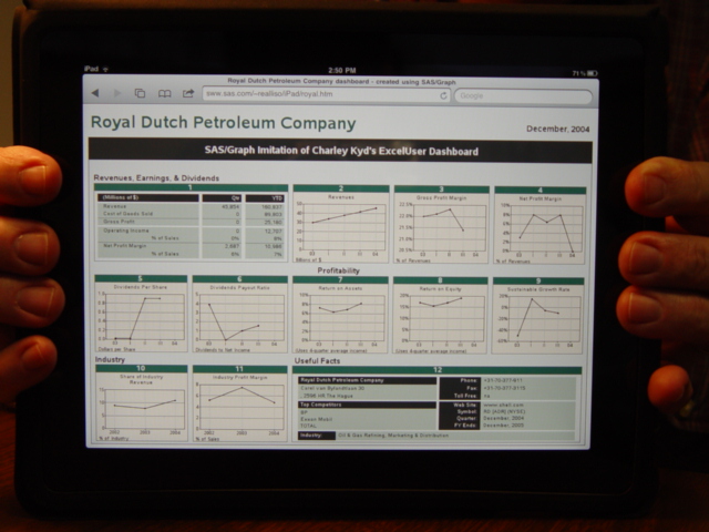
This dashboard is a SAS Imitation/enhancement of one of Charley Kyd's ExcelUser Dashboards...
Originally the ExcelUser dashboard at this link had the Royal Dutch
Petroleum data - now it has the same look, but Microsoft data...

   ExcelUser Dashboard
   (here's another link, with a little more details)


I have tried to model the SAS version very closely after the original,
only making small changes/enhancements.  Here are some of those
enhancements:

o Context-driven HTML charttips and drilldowns on many separate
  pieces of the graph, and pieces of text in the bottom/right table.
o Slightly larger/better font in the footnotes of each graph.
o Solid gray borders instead of dashed lines for borders around charts,
  making it easier on the eye to read the chart.
o Thinner lines in charts, with round marker at the data points - this
  gives better visual cues as to what were the actual data values, and
  what is the interpolated line.
o Lighter colored horizontal reference lines, so the dark data line
  is more prominent.
o Added very light/subtle vertical reference lines - these help show
  that some charts don't have any data/markers at the '04' tickmark.
o In the table at the bottom/right, I right-justified some of the
  white labels (such as phone:, fax:, etc) so they would be more
  positionally connected to the text that corresponded with the label.


SAS/Graph techniques used:

I used 'proc gplot' to create the individual plots, and I then used
'proc greplay' to position the multiple graphs on a single screen
(using a custom greplay template for positioning).
The green & tan To get the custom value labels along the horizontal
axis (03, I, II, III, 04) I created a special user-defined format.

The background in each chart was done using 2 annotated bars
(one for green and one for light tan) behind the chart.  I used
annotate's "html" variable (in conjunction with ods html) to create
html charttips and drilldowns for each graph -- this could have been
a drilldown to a more detailed chart, but since I don't have any
more detailed data, I just made it drilldown to a google search
using the keywords for that chart.  The drilldown is completely
configurable, so that you can drilldown to any graph, table, or
URL you want.

I annotated a 'proc gslide' containing annotated text for all the
overall titles of the sections of the screen.

The tables at the top/left and bottom/right were created using
annotated black and green bars, with pieces of text annotated
on top of the bars.  I used left & right justification (annotate
positions = '4' and '6') to line up the text as desired.

Back to Samples Index
  This dashboard is a SAS Imitation/enhancement of one of Charley Kyd's ExcelUser Dashboards...
Originally the ExcelUser dashboard at this link had the Royal Dutch
Petroleum data - now it has the same look, but Microsoft data...
ExcelUser Dashboard
(here's another link, with a little more details)
I have tried to model the SAS version very closely after the original,
only making small changes/enhancements. Here are some of those
enhancements:
o Context-driven HTML charttips and drilldowns on many separate
pieces of the graph, and pieces of text in the bottom/right table.
o Slightly larger/better font in the footnotes of each graph.
o Solid gray borders instead of dashed lines for borders around charts,
making it easier on the eye to read the chart.
o Thinner lines in charts, with round marker at the data points - this
gives better visual cues as to what were the actual data values, and
what is the interpolated line.
o Lighter colored horizontal reference lines, so the dark data line
is more prominent.
o Added very light/subtle vertical reference lines - these help show
that some charts don't have any data/markers at the '04' tickmark.
o In the table at the bottom/right, I right-justified some of the
white labels (such as phone:, fax:, etc) so they would be more
positionally connected to the text that corresponded with the label.
SAS/Graph techniques used:
I used 'proc gplot' to create the individual plots, and I then used
'proc greplay' to position the multiple graphs on a single screen
(using a custom greplay template for positioning).
The green & tan To get the custom value labels along the horizontal
axis (03, I, II, III, 04) I created a special user-defined format.
The background in each chart was done using 2 annotated bars
(one for green and one for light tan) behind the chart. I used
annotate's "html" variable (in conjunction with ods html) to create
html charttips and drilldowns for each graph -- this could have been
a drilldown to a more detailed chart, but since I don't have any
more detailed data, I just made it drilldown to a google search
using the keywords for that chart. The drilldown is completely
configurable, so that you can drilldown to any graph, table, or
URL you want.
I annotated a 'proc gslide' containing annotated text for all the
overall titles of the sections of the screen.
The tables at the top/left and bottom/right were created using
annotated black and green bars, with pieces of text annotated
on top of the bars. I used left & right justification (annotate
positions = '4' and '6') to line up the text as desired.
Back to Samples Index