Click here to see the SAS code.
Click here to see the example.

---------------------------------------------------------------


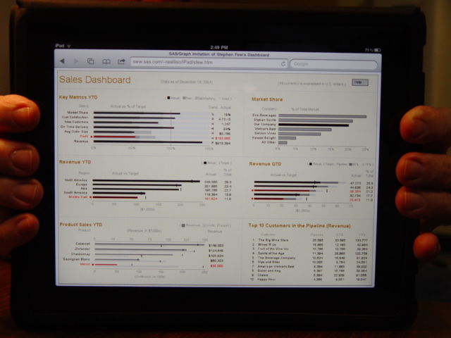
This is a sas/graph imitation of the dashboard on p. 177 in Stephen Few's
new dashboard book, with a few subtle changes (hopefully improvements :)

Here is a screen capture of Few's original dashboard.

List of Changes:

o Bars with 'poor' performance (needing attention) are outlined in red,
  and their associated text is also in red.  This makes it easier to
  quickly see all the associated information about the 'poor' performers
  (rather than just using a red dot beside them).

o In the top/left graph, instead of having a separate 'target' mark
  at the 100% value for each bar, a single reference line is used.
  This makes it easier to see that all these values are exactly 100%.

o In the top/left graph I use a "trend arrow" rather than the
  "sparklines" to show the data trend over the past 12 months.
  I haven't quite bought-into the concept of sparklines, since
  I think they are very dangerous since they don't have an axis
  scale.  People are naturally going to visually compare sparklines
  to other sparklines (or maybe compare them to previous years/versions
  of the same sparkline), as if they are plotted to the same scale -
  but there is really no guarantee what scale a sparkline is
  really plotted against.

o In all the bar-charts, I right-justify the bar label text,
  so the text is closer to the bar, and easier to tell which label
  goes with which bar.

o I make the column header text gray, rather than black, so that
  it appears less important than the actual data values & graphics.
  This difference in color also allows me to eliminate the line
  between the column headers and the graph.

o In the bottom/left graph, I add the text 'Revenue' and 'Units' as
  part of the individual axis labels, to help reinforce which is which.
  (It's a little hard to make the association from the legend in
  top/right corner of the graph alone).

o In the bottom/left graph, I use the dollar ($) format in the column
  of numbers to the right of the graph - this helps reinforce that
  this column only shows the $ revenue, and not the units quantity.

o In the % columns of the middle two graphs, I lengthen the column
  header from just '%' to '% of Total' - this makes it less ambiguous,
  and also eliminates the need to show the 100% sum under the column.

Back to Samples Index
  This is a sas/graph imitation of the dashboard on p. 177 in Stephen Few's
new dashboard book, with a few subtle changes (hopefully improvements :)
Here is a screen capture of Few's original dashboard.
List of Changes:
o Bars with 'poor' performance (needing attention) are outlined in red,
and their associated text is also in red. This makes it easier to
quickly see all the associated information about the 'poor' performers
(rather than just using a red dot beside them).
o In the top/left graph, instead of having a separate 'target' mark
at the 100% value for each bar, a single reference line is used.
This makes it easier to see that all these values are exactly 100%.
o In the top/left graph I use a "trend arrow" rather than the
"sparklines" to show the data trend over the past 12 months.
I haven't quite bought-into the concept of sparklines, since
I think they are very dangerous since they don't have an axis
scale. People are naturally going to visually compare sparklines
to other sparklines (or maybe compare them to previous years/versions
of the same sparkline), as if they are plotted to the same scale -
but there is really no guarantee what scale a sparkline is
really plotted against.
o In all the bar-charts, I right-justify the bar label text,
so the text is closer to the bar, and easier to tell which label
goes with which bar.
o I make the column header text gray, rather than black, so that
it appears less important than the actual data values & graphics.
This difference in color also allows me to eliminate the line
between the column headers and the graph.
o In the bottom/left graph, I add the text 'Revenue' and 'Units' as
part of the individual axis labels, to help reinforce which is which.
(It's a little hard to make the association from the legend in
top/right corner of the graph alone).
o In the bottom/left graph, I use the dollar ($) format in the column
of numbers to the right of the graph - this helps reinforce that
this column only shows the $ revenue, and not the units quantity.
o In the % columns of the middle two graphs, I lengthen the column
header from just '%' to '% of Total' - this makes it less ambiguous,
and also eliminates the need to show the 100% sum under the column.
Back to Samples Index