Click here to see the SAS code.
Click here to see the example.

---------------------------------------------------------------


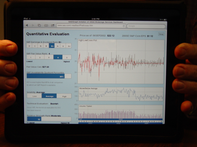
This is a SAS/Graph imitation of a dashboard/graph seen in a USAA mailing
advertisement for their "USAA Brokerage Service".

The 3 graphs are placed on the same page using 'proc greplay'.
The custom year/month/buy-sell axis at the borrom of the bottom graph
was done using 'annotate'.
The bottom graph uses the 'needle' interpolation to make the small
bar-chart-like lines.
The top chart uses the 'hiloc' (high/low/close) interpolation to
connect the stock prices.  A vertical black line connects the high/low
values for that week, and the red line connects all the 'closing'
values.

The original usaa hi/low/close chart had some extra lines like
"10 week moving average", but since my data was generated with a
random number generator, I opted to leave out the statistical
moving-average lines, etc (since they would show that my data
is really just "random noise" :)  Such lines and analyses could
easily be added (they're the bread-n-butter of sas :)

All of the stuff in the left-half of the graph is done using
annotated 'bar' and annotated 'text'.

This is just a proof-of-concept, and a lot of things are hard-coded
in this example.  It would take quite a bit of work to generalize
this so that it would work with any data you throw at it (but it is
do-able in sas/graph, as this poc demonstrates :)

Back to Samples Index
  This is a SAS/Graph imitation of a dashboard/graph seen in a USAA mailing
advertisement for their "USAA Brokerage Service".
The 3 graphs are placed on the same page using 'proc greplay'.
The custom year/month/buy-sell axis at the borrom of the bottom graph
was done using 'annotate'.
The bottom graph uses the 'needle' interpolation to make the small
bar-chart-like lines.
The top chart uses the 'hiloc' (high/low/close) interpolation to
connect the stock prices. A vertical black line connects the high/low
values for that week, and the red line connects all the 'closing'
values.
The original usaa hi/low/close chart had some extra lines like
"10 week moving average", but since my data was generated with a
random number generator, I opted to leave out the statistical
moving-average lines, etc (since they would show that my data
is really just "random noise" :) Such lines and analyses could
easily be added (they're the bread-n-butter of sas :)
All of the stuff in the left-half of the graph is done using
annotated 'bar' and annotated 'text'.
This is just a proof-of-concept, and a lot of things are hard-coded
in this example. It would take quite a bit of work to generalize
this so that it would work with any data you throw at it (but it is
do-able in sas/graph, as this poc demonstrates :)
Back to Samples Index