Click here to see the SAS code.
Click here to see the example.

---------------------------------------------------------------


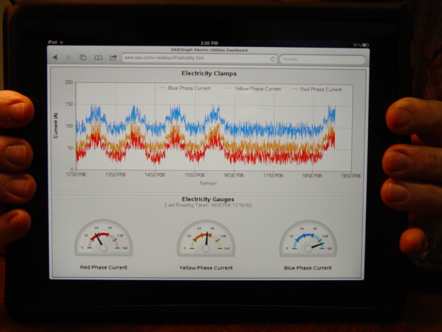
This example is a sas/graph imitation of the following dashboard.

The first 1/3 of the code is generating some random data to simulate the
data in the original dashboard - in a real-world situation, you would
have real data, and you won't need to generate this random data, of course.

I then query the data, and generate some macro variables containing the
last (most current) readings, and I use the new v9.2 "proc gkpi" to create
some kpi 'speedometer' gauges.  Since 'proc gkpi' doesn't create grsegs,
I have to write the gauges to png files, and then read the png's back
into sas and annotate them back onto a 'proc gslide' so I can have a
grseg version to annotate back into my dashboard.  While I'm doing this,
I also use the annotate 'html' variable to code in a charttip and
drilldown for the gauge (proc gkpi doesn't support charttip & drilldown
on its own).

I then create a gplot with 3 overlaid lines, and also save it in a grseg.

I also create some extra grsegs with gray areas, and titles, to get my
dashboard looking exactly the way I want.

And finally, I create a custom greplay template, and use "proc greplay"
to replay my 3 gauge grsegs and 1 plot grseg (and the gray & title
grsegs) into the dashboard.

The original dashboard had a "Reset Zoom" button.  I changed this to "Refresh".
Although this is a static copy of the output, this 'refresh' button shows that
you can run a URL ... and of course that URL could be a SAS Stored Process URL
(or SAS/Intrnet app dispatcher URL) which could run this sas job, and get the
latest/greatest data, and re-draw the dashboard with the latest values.

Back to Samples Index
  This example is a sas/graph imitation of the following dashboard.
The first 1/3 of the code is generating some random data to simulate the
data in the original dashboard - in a real-world situation, you would
have real data, and you won't need to generate this random data, of course.
I then query the data, and generate some macro variables containing the
last (most current) readings, and I use the new v9.2 "proc gkpi" to create
some kpi 'speedometer' gauges. Since 'proc gkpi' doesn't create grsegs,
I have to write the gauges to png files, and then read the png's back
into sas and annotate them back onto a 'proc gslide' so I can have a
grseg version to annotate back into my dashboard. While I'm doing this,
I also use the annotate 'html' variable to code in a charttip and
drilldown for the gauge (proc gkpi doesn't support charttip & drilldown
on its own).
I then create a gplot with 3 overlaid lines, and also save it in a grseg.
I also create some extra grsegs with gray areas, and titles, to get my
dashboard looking exactly the way I want.
And finally, I create a custom greplay template, and use "proc greplay"
to replay my 3 gauge grsegs and 1 plot grseg (and the gray & title
grsegs) into the dashboard.
The original dashboard had a "Reset Zoom" button. I changed this to "Refresh".
Although this is a static copy of the output, this 'refresh' button shows that
you can run a URL ... and of course that URL could be a SAS Stored Process URL
(or SAS/Intrnet app dispatcher URL) which could run this sas job, and get the
latest/greatest data, and re-draw the dashboard with the latest values.
Back to Samples Index