Click here to see the SAS code.
Click here to see the example.

---------------------------------------------------------------

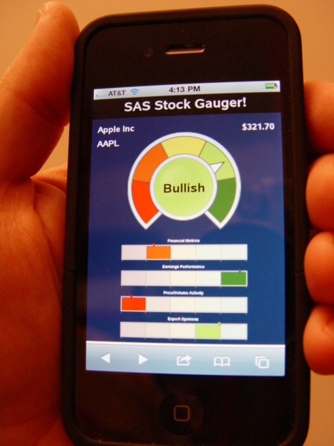
The indicators in this example were created using SAS/Graph "proc gkpi".
First the kpis were generated, saving them into png files,
and then the png files were annotated onto blank "proc gslide"s.
The gslides' grsegs were then placed on the dashboard using
"proc greplay" (and a custom layout greplay template).

In the dial gauge (at the top), the middle of the dial turns
the same color as the range the value is pointing to, making
it easy to tell, by just looking at the color of the middle
of the gauge.

In the 4 hslider (horizontal slider) charts at the bottom,
I get a little tricky with the colors.  I make the default
colors very pale/washed-out versions of the regular colors,
and when the marker is pointing to a segment I make it a
bright version of the color.  That way, you can easily tell
at a glance which segment the marker (slider) is pointing to.


Back to Samples Index
  Back to Samples Index