Click here to see the SAS code.
Click here to see the example.

---------------------------------------------------------------

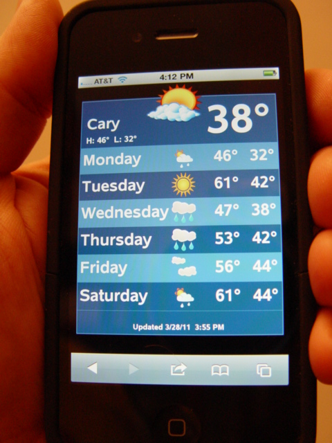
This one is a "proc gplot" - only using gplot so that I can have a
convenient coordinate system to annotate the lines of data onto.

I annotate alternating colored 'bars' behind the lines of text/images
for each day of weather.

This example is data-driven, but I don't have it "hooked up" to
get the latest/greatest weather data (ie, I just took a 'snapshot'
of the weather at the time I created the example).  Therefore,
it doesn't show the actual/current weather, but is just a
proof-of-concept.

This *could* be set up to get the current weather, and draw
the graphic based on that current data, via SAS/IntrNet
and/or Stored Process, of course.  (If we had a good/reliable
source for the current data.)


Back to Samples Index
  Back to Samples Index