|
|
|
|
View Menu
Note:
The View menu might not be available in some charts.
The View menu includes the following options:
You can use these options to modify the appearance of your chart. To save your changes, select File  Save Preferences. Save Preferences.
View Markers
This option enables you to choose whether to show the milestone and target markers:
- Milestone
shows the milestone markers. A milestone marker is drawn when a start and finish pair (early start and early finish,
late-start and late-finish, and so on) have the same value, and the corresponding cell in
the duration column has a value of zero. By default, a milestone marker is a filled down-triangle enclosed
in a circle ( ). The fill color depends on the chart style.
You can change the marker symbol and color by selecting Format Chart, and then clicking the Markers tab. ). The fill color depends on the chart style.
You can change the marker symbol and color by selecting Format Chart, and then clicking the Markers tab.
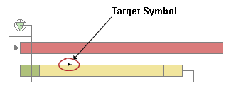
- Target
shows the target markers. A target marker shows the target date for completion of a project. By default, a
target marker is the filled flag symbol
( ).
You can change the marker symbol and color by selecting Format Chart, and then and clicking the Markers tab. The default
target symbol is shown in the following display: ).
You can change the marker symbol and color by selecting Format Chart, and then and clicking the Markers tab. The default
target symbol is shown in the following display:
Unlike a milestone marker, whose date is inferred from the values of the other columns (start,
finish, and duration) in the schedule data set, a target symbol's date must be defined explicitly in
the schedule data set.
- All
shows the milestone and target markers.
- None
hides the milestone and target markers.
View Schedules
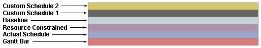
This option enables you to choose whether to show the Actual, Baseline, Gantt, Resource, and custom schedule bars (if any), and whether to show the slack times on the Gantt bar. When you select this option, a list of the bars appear in the menu as shown in the following display.

A check mark to the left of each bar name indicates that the bar is displayed in the chart. If no check mark appears, the bar is hidden. When you select an item, the display state toggles between show and hide. In addition to the Actual, Baseline, Gantt, Slack, and Resource bars, up to two custom schedule bars might appear in the menu. The name and purpose of each of the custom schedule bars is determined by the chart author. If custom schedule bars are not used in the chart, Custom Schedule 1 and Custom Schedule 2 appear grayed out in the menu as shown in the previous display.
The following display shows all of the possible bars.
Note:
The bar colors shown reflect the default style. The bar colors in the chart that you are viewing might be different.
In addition to the Custom Schedule 1 and Custom Schedule 2 bars, some of the other bars might not be displayed in the chart that you are viewing.
In the View Schedules menu, select All to show all of the bars and the slack times, or None to hide all of the bars. Select a bar name in the menu to show or hide the corresponding bar. Select Slack to show or hide the slack times on the Gantt bar.
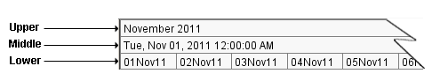
View Timescale
This option enables you to choose whether to show the upper, middle, and lower time scales. The following display shows the three time scales.
Select All to show all of the time scales, or None to hide all of the time scales.
To change the time scales, use Format Timescale.
View Data Filter
This option enables you to filter the schedule data based on the value of one or more variables in the chart data. It opens the Data Filter dialog box, which is shown in the following display.
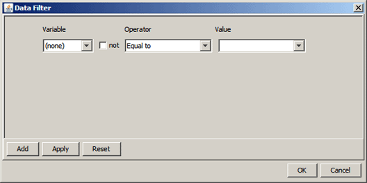
The Data Filter dialog box enables you to construct one or more WHERE clauses using the variables in the chart. To construct a WHERE clause, do the following:
- Under Variable, select the variable that you want to filter on.
- Under Operator, select the operator that you want to use. To specify the inverse of the operator, select the not check box to the left of the Operator list box.
- Under Value, select or type the variable value that you want to use. For date variables, when you click the down arrow to the right of the list box, a date picker is opened in which you can select a date. For text and numeric values, you can select a value from the list or type in your own.
Note: Text value matching is case sensitive.
If you want to add another clause, click Add. A new clause is added to the dialog box as shown in the following figure.
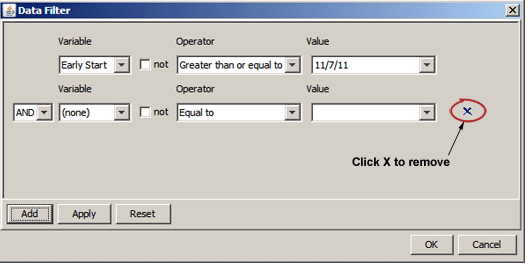
In the list box to the left of the new clause, select AND or OR as the logical operator with the previous clause, and then select the Variable, Operator, and Value for the new clause as you did for the first clause. Repeat this process for each clause that you want to add. To remove a clause, click the X to the right of the clause that you want to remove. To clear the criteria and start over, click Reset.
When you have specified all of your WHERE clauses, click Apply to apply the filter to your chart. When the filter is applied, only the activities that meet the filter criteria are displayed. If no activities meet the criteria, an empty schedule is displayed. If the result is not what you expected, modify your criteria as needed, and then click Apply. Otherwise, click OK to close the Data Filter dialog box.
The data filter remains in effect for as long as the chart is open or until you click Reset on the Data Filter dialog box. When you close the chart, the filter is discarded.
Note: The File Save Preferences menu option, when available, does not save the data filter criteria.
View References
This option enables you to choose whether to show the time-now line, weekends, and holidays on your chart. It opens the References dialog box, which is shown in the following display.
The References dialog box consists of three tabs:
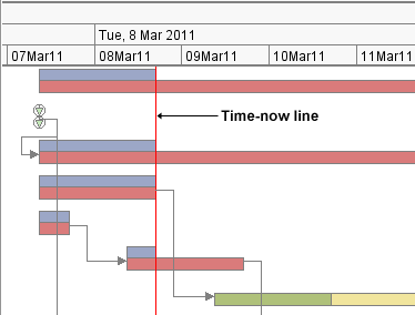
Using the Timenow Tab
On the Timenow tab, you can choose whether to draw a time-now line, which is a vertical line that shows one of the following:
The following display shows an example of a time-now line.
You can specify the width, type, and color of the time-now line.
Using the Weekends Tab
On the Weekends tab, you can choose whether to shade the areas of the chart that correspond to the weekends. You
can specify the shading color and whether the shading should be semi-transparent. If you select Semi-transparent, the background shows through the shading. Otherwise, the shading
obscures the background.
The following display shows the GEARS style with the weekends shaded blue and the Semi-transparent option selected.
Notice that the background is visible through the shading.
Using the Holidays Tab
On the Holiday tab, you can choose whether to shade the areas of the chart that correspond to the holidays. You
can specify the shading color and whether the shading should be semi-transparent. If you
select Semi-transparent, the background shows through the shading. Otherwise, the shading
obscures the background.
Note: This option is available only if the chart includes information about the holidays.
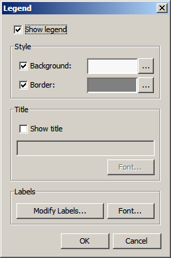
View Legend
This option enables you to choose whether to show a legend at the bottom of your chart and modify the appearance of the legend. It opens the Legend dialog box, which is shown in the following display.
On the Legend dialog box, you can do the following:
- show or hide the legend in your chart
- change the legend background color or remove the legend background and allow the chart background to show through
- change the legend border color or remove the legend border
- add a title to your legend, modify the text and font of the existing title, or remove the existing title
- modify the legend entries based on the legend type:
- for a default legend, change the text of the legend entry labels in the default legend
- for a color-by legend, add a new entry to a color-by legend
- change the font of the legend labels
About the Chart Legends
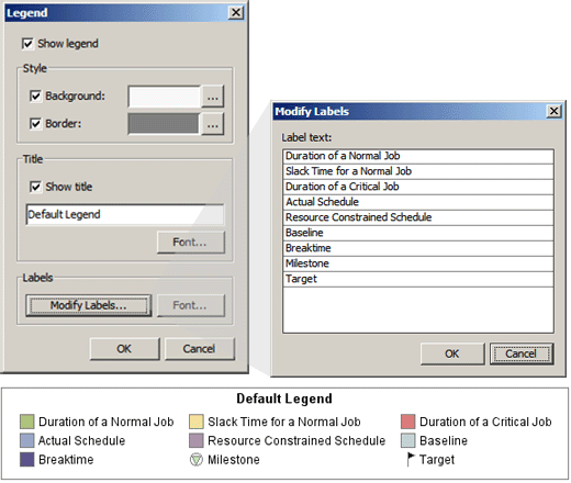
The ISV Applet provides two types of chart legends: a default legend and a color-by legend. When the default
legend is used in a chart, the chart colors are based on some or all of the following items:
- Duration of a Normal Job
- Slack Time for a Normal Job
- Duration of a Critical Job
- Actual Schedule
- Resource Constrained Schedule
- Baseline
- Breaktime
If the chart includes target and milestone markers, Target and Milestone also appear
in the legend. A
sample default legend is shown in the following display.
Note: The colors shown reflect the default style. The legend items and colors in the chart that
you are viewing might be different.
When a color-by legend is used in a chart, the chart colors are based on a subgroup variable in the chart data. The chart
author specifies the subgroup variable by setting the COLOR_BY parameter in the chart HTML file to the name of the subgroup variable in the chart
data. The labels in a color-by legend reflect the values of the subgroup variable.
For information about
the COLOR_BY parameter, see SAS/GRAPH: Interactive Schedule Viewer Applet User's Guide.
Note: If the bars for one or more items are hidden, then when a color-by legend is used, the hidden
item appears in the legend, but no bars for the item appear in the chart.
Modifying the Legend
You can modify the legend. The modifications that you can make depends on the legend type. For a default legend, you can modify the legend item labels. For a color-by legend, you can add new items to the legend and you can modify the label of the Target and Milestone items. However, you cannot change the labels of the other items in a color-by legend. Modify Labels on the Legend dialog box opens the Modify Labels dialog box on which you can modify labels or add items as appropriate. The following display shows an example of the Modify Labels dialog box for a default legend.
Modifying the Default Legend
To change an item label in the default legend, do the following:
- In the Legend dialog box, click Modify Labels to open the Modify Labels dialog box.
- In the Modify Labels dialog box, double-click the label that you want to change, and then change
the text to a unique label.
Note: The new label must be unique. If you specify a label that is already in use in the legend, an error message is displayed.
- Repeat step 2 for any other labels that you want to change.
- Click OK to close the Modify Labels dialog box.
Your changes appear in the chart legend.
Modifying a Color-By Legend
To add new
items to a color-by legend, do the following:
- In the Legend dialog box, click Modify Labels to open the Modify Labels dialog box.
- In the Modify Labels dialog box, double-click any item in the list except Target or Milestone.
- Change the label of the item that you selected to a unique label for the item that you want to add.
Notes:
- Changing the label does not change the label of the item that you selected. A new item is added with the label that you specify when you click another label or click OK.
- The new label must be unique. If you specify a label that is already in use in the legend, an error message is displayed.
- If you want to add another item, repeat from step 2. Otherwise, click OK to close the Modify Labels dialog box.
The value that you added appears in the legend, and the value of the item that you selected is left unchanged. A color is automatically
assigned to the new value.
To change the label of the Target or Milestone item in a color-by legend, do the following:
- In the Legend dialog box, click Modify Labels to open the Modify Labels dialog box.
- In the Modify Labels dialog box, double-click the label of the Target or Milestone item, and then change
the text to a unique label.
Note: The new label must be unique. If you specify a label that is already in use in the legend, an error message is displayed.
- Click OK to close the Modify Labels dialog box.
Your changes appear in the chart legend.
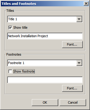
View Titles
and Footnotes
This option enables you to add titles and footnotes to the chart. It opens the Titles and Footnotes dialog box, which is shown in the following display.
On the Titles and Footnotes dialog box, you can specify
the text, font, size, and color of the titles and footnotes that you want to add to the chart. You can add up to four titles and two footnotes. You can specify different font attributes for each title and footnote.
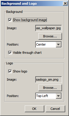
View Background
and Logo
This option enables you to choose a background image, a logo image, or both, for the chart. It opens the Background and Logo dialog box, which is shown in the following display.
On the Background and Logo dialog box, you can specify the image file and position of a background image and a logo. For a
background image, you can specify where a background image is displayed, its position in the background area, and whether it
is visible through the chart. For a logo image, you can specify where to display it
(top left, top right, bottom left, or bottom right). The ISV Applet accesses background and logo images through a Web server using the HTTP protocol. In order to specify a background image and a logo image, the chart that you are viewing must be configured to use a valid URL to access the available image files, and the URL must not be password protected.
If the URL is password protected, you are prompted for a user ID and password when you add a background or logo image to the chart. In that case, after you enter a valid user ID and password, you can add a background or logo image to the chart. However, because the ISV Applet cannot prompt you for a user ID and password when the chart is opened, it displays the following error message when the chart is reopened:
The specified background image or logo "image-URL" is password protected. Cannot be accessed.
After the error message dialog box is dismissed, the chart opens normally, but the background image and logo image are not displayed on the chart in that case.
To specify or change a background image or logo, do the following:
- If not already selected, select Show background image or Show logo as appropriate.
- Select Browse to open the Open dialog box.
Note: An error message is displayed if the ISV Applet cannot access the image files.
- If the Password required dialog box appears, the images at the specified URL are password protected and cannot be used with the ISV Applet. In that case, click Cancel on the Password required dialog box and on the Background and Logo dialog box to cancel the operation. Otherwise, continue to the next step.
- In the Open dialog box, select the image file that you want to use, and then click Open.
- For Position, select an appropriate position for the image, and then click OK.
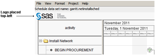
A logo image should be small enough to fit in the area of the
chart that is reserved for the chart titles. The height of this
area depends on the number of titles that are specified (maximum four) and the size of the title font.
The following display shows the SAS logo placed in the top left corner.
To remove the background or logo image, in the Background and Logo dialog box, deselect Show background image or Show logo (or both), and then click OK.
If you want to save the changes that you have made to the background image or logo for future chart viewings, select File Save Preferences in the ISV Applet menu bar.
Note: The File Save Preferences option might not be available in some charts.
View Grid
This option enables you to choose whether to display a grid over the chart. If a grid is displayed,
then vertical lines are drawn to delimit the increments in the middle time scale, and horizontal lines are drawn to
delimit the items in the table.
View Zoom
This option enables you to choose how much of the entire project to show in the chart area of the window at
one time without scrolling. Valid choices for the zoom menu are the following:
- Default
- allow the Interactive Schedule Viewer to determine how much of the schedule should be displayed in the chart area based on the length of the project.
- 1 day
- zoom in to use the entire chart area to display a single day. With
this option, you must scroll to see earlier or later days.
- 1 week
- zoom in to use the entire chart area to display one week. With this
option, you must scroll to see earlier or later weeks.
- 1 month
- zoom out in order to use the entire chart area to display one month. With this
option, you must scroll to see earlier or later months.
- Project width
- zoom out in order to show the entire project within the chart area. The scrolling
functionality is not available because the entire project
is already displayed.
- Custom
- choose how much of a project to display in the chart area. You can choose
any number of days, weeks, months, quarters, or years.
Note: These choices are not affected by the size of the browser
window. For example, if you choose Project width, then the
entire project is displayed in the chart area regardless of whether your browser window is
large or small.
Note: You can also use the scroll bar to
zoom.
|


